
In MOSS there is a ‘Charts’ tab where MOSS data is visualised at trust site level.
There are 2 charts to view: the Maternity Outcomes Signal chart and the Excess Events chart.
Maternity Outcomes Signal chart
The Maternity Outcomes Signal chart produces ‘signals’ of potential safety issues in maternity care arising during labour and birth using term stillbirths and term neonatal deaths up to 28 days.
Signals are generated from an accumulation of events in near-real time.
Trends are plotted based on the accumulation of events compared to a national reference rate – a rate of events on what would normally be expected in a given site based on its birth population.
A rise indicates the rate of events is increasing compared to what would normally be expected.
Signals are generated when there is a recent doubling in the rate of events compared to what would normally be expected.
The colour of signals simply refers to statistical confidence – amber means we are 95% confident the rate has doubled (level 1) and red means we are 99% confident (level 2).
For detailed information, please see Annex 4: Methodology and data sources.
After a red (level 2) signal, the chart resets to remain sensitive to future signals. The reset does not mean that potential safety issues have been resolved, which should be clarified through local perinatal quality governance processes.
When any signal occurs, the maternity service’s perinatal leadership team should carry out a critical safety check (Annex 1) to make sure care on the labour ward is safe.
Further explanations on how to interpret the Maternity Outcomes Signal chart are below:
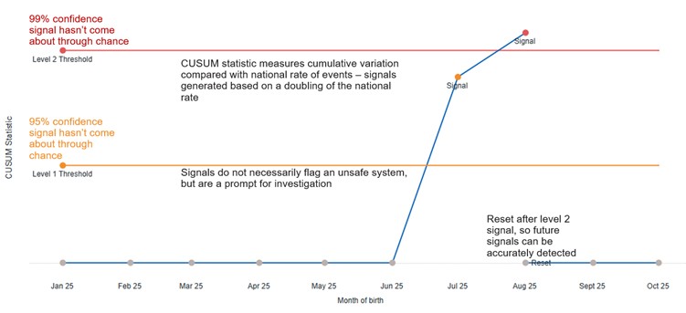
The chart plots CUSUM statistic against month of birth.
This shows the level 1 (amber) threshold, giving a 95% confidence level that the signal has not come about through chance; and level 2 (red), representing a 99% confidence level that the signal has not come about through chance.
The chart notes that signals do not necessarily flag an unsafe system, but are a prompt for investigation; and that the CUSUM statistic measures cumulative variation compared with the national rate of events, with signals generated based on a doubling of the national rate.
Finally, the chart shows that once the level 2 signal has been triggered, the chart resets so that future signals can be accurately detected.
Excess events chart
The Excess Events chart does not generate signals. However, it uses the same near-real time events data that supplies the Maternity Outcomes Signal chart, plotting the individual events cumulatively over time in a given site.
Events that contribute towards signals are coloured appropriately to correspond with the level of signal that occurred.
The Excess Events chart can be useful as a companion to the Maternity Outcomes Signal chart, to help services identify which events have contributed towards generating signals. It also shows patterns more clearly over time.
Data points plotted on the zero line mean that the rate of events is equal to the national reference rate, or what would normally be expected in a given site based on its birth population.
Rises above the zero line mean that the rate of events is increasing and is ‘in excess’ of what would normally be expected. Steeper rises are more likely to correspond with signals.
Falls below the zero line mean that the rate of events has decreased compared to what would normally be expected.
To note – a steep rise (and signal) can still occur beneath the zero line, where events have occurred in quick succession.
Unlike the Maternity Outcomes Signal Chart, this chart does not reset after a level 2 signal. This helps to show more patterns of events more clearly over time.
For detailed information, please see Annex 4: Methodology and data sources.
Further explanation on how to interpret the Excess Events chart is below:
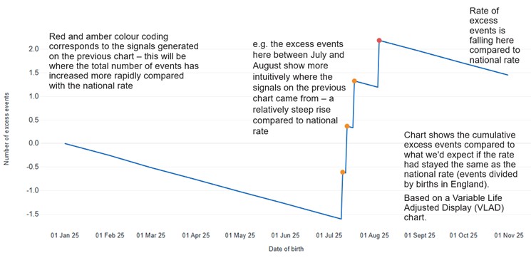
The chart plots number of excess events against date of birth, with red and amber colour coding corresponding to the signals generated on the previous chart – where the total number of events has increased more rapidly compared with the national rate.
For example, the excess events on this chart between July and August 2025 – 4 sharp rises, following and preceding shallow declines – show more intuitively where the signals on the previous chart came from – a relatively steep rise compared to the national rate.
The chart shows the cumulative excess events compared to what we’d expect if the rate had stayed the same as the national rate (events divided by births in England); based on a variable life adjusted display (VLAD) chart.
Following the sharp summer rises, the rate of excess events returns to falling compared to the national rate.
Publication reference: PRN02089_iv