Colours
Colour is a key element of any organisation’s identity. Our research shows that patients and the public strongly associate the NHS with the colours blue and white. 87% of people spontaneously recall these two colours when asked about the NHS Identity.
Therefore, NHS Blue and white are the dominant colours in the NHS colour palette. They help signpost people to NHS organisations and services, by ensuring that materials are instantly recognisable as originating from the NHS. They also ensure that communications maximise the strong value of the NHS Identity and the positive attributes that patients, the public and stakeholders attach to the NHS.
It is important to note that the NHS colour palette applies to the design of NHS communications including graphics and illustrations. For illustrations, we recognise that the palette does not include colours for skin tones. Please use the colours you require for that purpose. The colour palette does not apply to portrait/subject photography. Colour photography usually contains a multitude of colours and does not need to reflect the NHS colour palette or the colour emphasis shown below. However, abstract images do need to follow the NHS colour palette as the images are being used as graphics.
Core NHS colours
NHS Blue
Pantone: 300
CMYK: 99/50/0/0
RGB: 0/94/184
#005EB8
RAL: 5017
White
CMYK: 0/0/0/0
RGB: 255/255/255
#FFFFFF
The core NHS Blue and white are supported by four other groups of colours in the NHS colour palette, to provide NHS organisations with the flexibility to differentiate their communications from each other, but not from the NHS.
The colours in the NHS colour palette all offer at least an AA accessibility rating, with many offering the maximum AAA rating when used with sufficient contrasts on appropriate backgrounds.
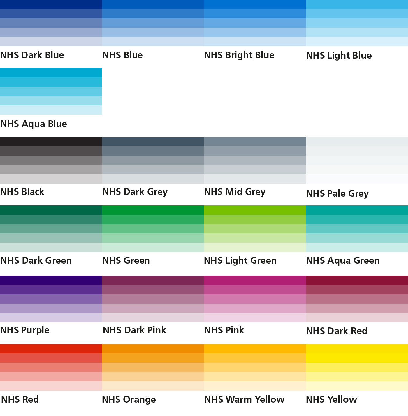
Level 1: NHS blues
This is the top level palette that reinforces people’s association with blue and white. There are a number of hues to support the main NHS Blue colour to give lighter and darker alternatives to add tonal variety.
NHS Dark Blue
Pantone: 287CMYK: 100/75/2/18
RGB: 0/48/135
#003087
NHS Blue
Pantone: 300CMYK: 99/50/0/0
RGB: 0/94/184
#005EB8
NHS Bright Blue
Pantone: 285CMYK: 90/48/0/0
RGB: 0/114/206
#0072CE
NHS Light Blue
Pantone: 298CMYK: 67/2/0/0
RGB: 65/182/230
#41B6E6
NHS Aqua Blue
Pantone: 312CMYK: 88/0/11/0
RGB: 0/169/206
#00A9CE
Level 2: NHS neutrals
These colours help to support the top level blues. Black and dark grey can be used for type, depending on the background and application. The lighter greys can be used as backgrounds when they are appropriate and are useful online colours. White is, of course, the most important neutral base. These colours will support the overall blue and white look if they are used with the proper emphasis.
NHS Black
Pantone: Black 6CMYK: 100k
RGB: 35/31/32
#231f20
NHS Dark Grey
Pantone: 7545CMYK: 58/32/18/54
RGB: 66/85/99
#425563
NHS Mid Grey
Pantone: 7544CMYK: 35/14/11/34
RGB: 118/134/146
#768692
NHS Pale grey
Pantone: 7541CMYK: 7/1/3/2
RGB: 232/237/238
#E8EDEE
White
CMYK: 0/0/0/0RGB: 255/255/255
#FFFFFF
Level 3: NHS support greens
Green is close to blue in the colour spectrum and gives a feel of being in the same colour family. Therefore, when they are used moderately and in a secondary support role, they will not compromise the strong associations people have with blue and white. However, if it becomes too dominant it will impact on people’s ability to instantly recognise the NHS as being the source of the information.
NHS Dark Green
Pantone: 342CMYK: 93/10/75/43
RGB: 0/103/71
#006747
NHS Green
Pantone: 355CMYK: 91/0/100/0
RGB: 0/150/57
#009639
NHS Light Green
Pantone: 368CMYK: 65/0/100/0
RGB: 120/190/32
#78BE20
NHS Aqua Green
Pantone: 3272CMYK: 94/0/48/0
RGB: 0/164/153
#00A499
Level 4: NHS highlights
Highlights are very useful for drawing attention to details, helping to warm up the blue look and providing accent colours to enable NHS organisations, partnerships and services to differentiate themselves from each other. However, they should not be used too heavily otherwise they change the overall look dramatically and people will not associate your communication with the NHS. Therefore, use minimally and do not use large blocks of these highlight colours.
The highlight colour ‘Emergency Services Red’ is not exclusively for use in relation to emergency and urgent care services. However, because of its strong association and use in this area, you should carefully consider how you use it for other purposes.
Euro Ambulance Yellow is a colour reference to be used for ambulance livery only.
NHS Purple
Pantone: 2685CMYK: 90/99/0/8
RGB: 51/0/114
#330072
Dark Pink
Pantone: 683CMYK: 26/99/12/50
RGB: 124/40/85
#7C2855
NHS Pink
Pantone: 675CMYK: 18/100/0/8
RGB: 174/37/115
#AE2573
NHS Dark Red
Pantone: 1955CMYK: 9/100/54/43
RGB: 138/21/56
#8A1538
Emergency Services Red
Pantone: 485RAL 3020 Traffic Red
CMYK: 0/95/100/0
RGB: 218/41/28
#DA291C
NHS Orange
Pantone: 144CMYK: 0/51/100/0
RGB: 237/139/0
#ED8B00
NHS Warm Yellow
Pantone: 1235CMYK: 0/31/98/0
RGB: 255/184/28
#FFB81C
NHS Yellow
Pantone: Process YellowCMYK: 0/0/100/0
RGB: 250/225/0
#FAE100
Euro Ambulance Yellow
RAL 1016 Sulphur YellowColour emphasis
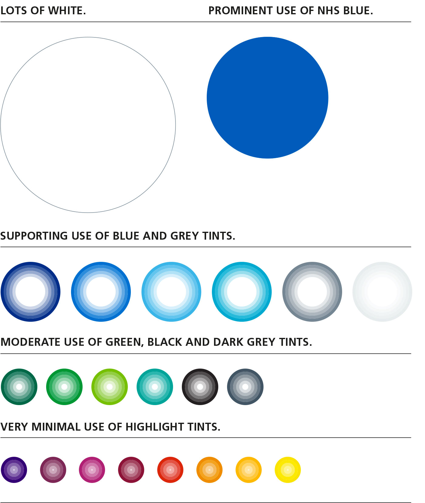
Follow this guide to get the overall colour emphasis right. NHS Blue and white must always be the dominant colours. They can be supported by the other colours in the NHS colour palette as long as they are used in decreasing levels of emphasis, as shown in the chart below. This ensures that materials are instantly recognisable as originating from the NHS.
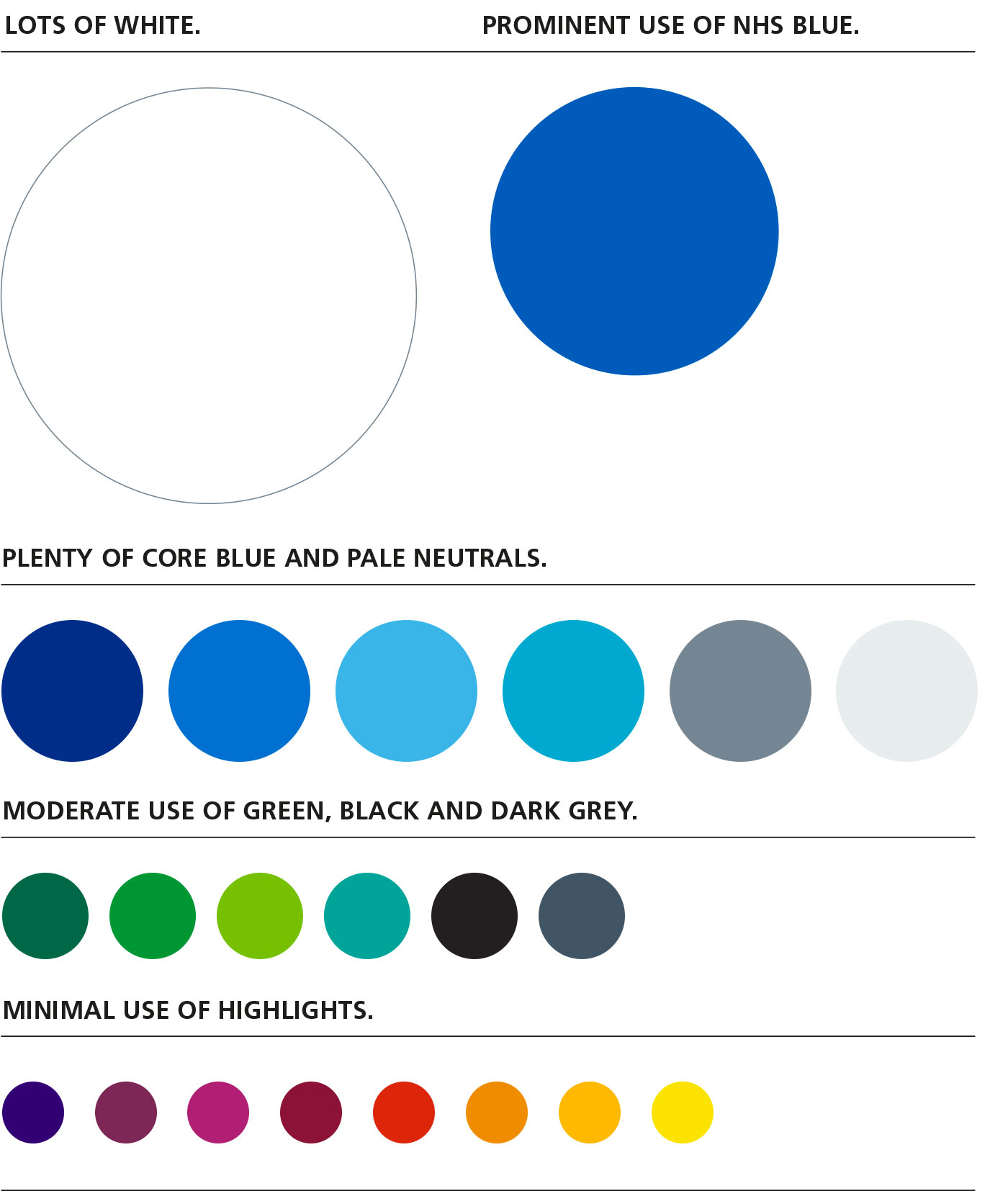
What does this mean in practice?
Here is an example of how the colour emphasis works in practice. This has:
- plenty of white
- prominent use of NHS Blue
- minimal use of highlights.
Using tints
Tints are percentage values of the colours which look like this:
The top bar in each case shows the solid (100%) value of the colour and the bars below show decreasing values from 80% to 20%. It is acceptable to use tints of the colours. Any % value is accepted as long as it is visible, clear and accessible.
However, three important factors need to be considered when using tints:
- type and NHS logos should always be reproduced in 100% solid colour, never in a tint
- the NHS logo should never be reversed out of a tint, only out of 100% solid NHS Blue
- 100% solid NHS Blue should always be the dominant colour over any tints
- tints should never endanger the legibility or accessibility of any communication
- the colour emphasis should always be adhered to when using tints, as shown below.
Emphasis of tint use
100% solid NHS Blue and white must always be the dominant colours used. They can be supported by tints of the other colours in the NHS colour palette as long as they are used in decreasing levels of emphasis, as shown in the chart below.