Visual styles, graphic devices and straplines
The single NHS Identity was introduced in 1999 to clearly signpost patients to NHS organisations and services. It is the visual representation of the values and purpose of the NHS – a national service, accessible and free to all. Since being introduced, the NHS Identity is now instantly recognised by 98% of the public. Our public research also shows a clear preference for an NHS Identity that is easily identifiable and consistently presented – it reassures patients that they can rely on the quality of service being provided. “It’s NHS – you know you can trust it.”
Where NHS organisations are deviating from the NHS Identity, it creates confusion, mistrust and concern. Our patients expect a national, unified health service. At all patient touchpoints of that service, they expect to see the NHS logo, and the identity, applied consistently and uniformly. It reassures them that they can rely on the quality of service being provided.
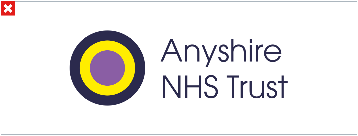
Where NHS organisations are using alternative logos either instead of, or as well as their NHS organisation’s logo, people perceive it is a service provided by the private sector or a service run in partnership with another independent, non-NHS organisation. Therefore, alternative logos to the NHS logo are not permitted. This includes alternative logos for buildings, departments, teams, organisations, services, programmes and partnerships.
By logo we mean any mark, emblem or symbol, often including a name, used as a graphic design element, as shown in the example below. It may be a purely graphic symbol, stylised wording, or a combination of both. Alternative logos are usually positioned where you would expect to see your NHS logo or a partner logo (e.g. top right or top left).
The emblem of a red cross, with arms of equal length on a white background, is the visible sign of neutrality and protection under the Geneva Conventions. As such, it is the emblem of the armed forces’ medical services and its use is controlled by governments around the world. Due to the simplicity of its design, any type of red cross or plus symbol could easily be mistaken for the protected red cross emblem. Therefore, we do not use any icons of a similar design.
However, we understand that NHS organisations need to be able to differentiate themselves from each other. Differentiation can be expressed in a number of ways – reputation, quality etc. – not just through your visual style. The Identity guidelines provide enough flexibility to enable you to visually differentiate your NHS organisation from others, without visually differentiating it from the NHS.
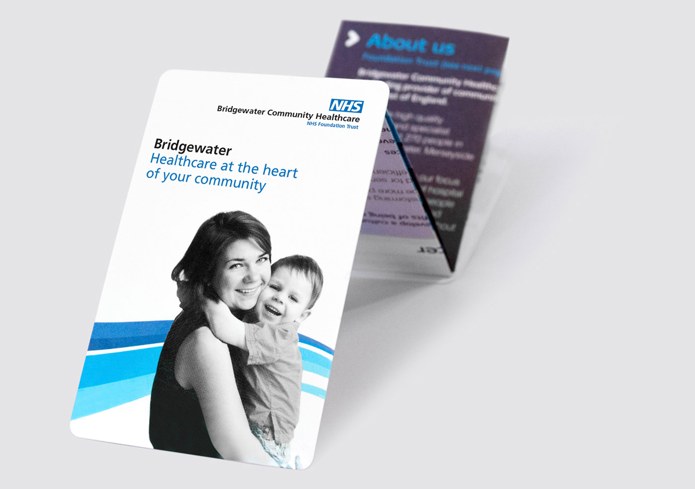
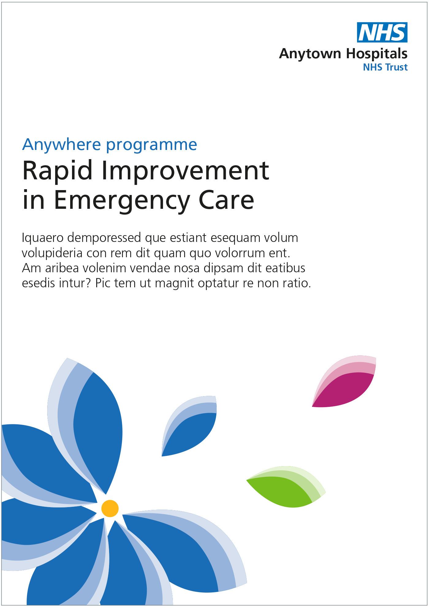
Graphic devices, straplines and imagery can be used to create a distinctive visual style for your NHS organisation, partnership, service or campaign. Graphic devices and straplines should not be placed too close to, or incorporated into, your NHS logo or be positioned where you would expect to see your NHS logo or a partner logo (e.g. top right or top left).
The core colours of NHS Blue and white are a vital element of the NHS Identity and must always be the dominant colours used. However, the NHS colour palette includes four other groups of supporting colours. These provide the option of using accent colours to enable NHS organisations, partnerships and services to distinguish themselves from each other.
You can also use photographic and illustrative styles as part of your visual style.
Below are some examples of visual styles which adhere to the NHS Identity guidelines and maximise the value of the NHS Identity. To see more visuals visit the visual styles, graphic devices and straplines examples pages.
Print examples
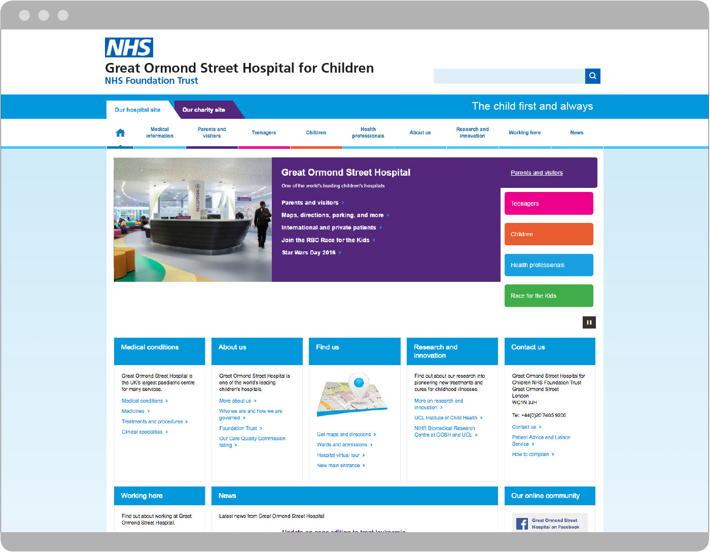
Digital examples
On NHS websites, the top of the page should be kept clear of graphic devices, straplines and imagery.
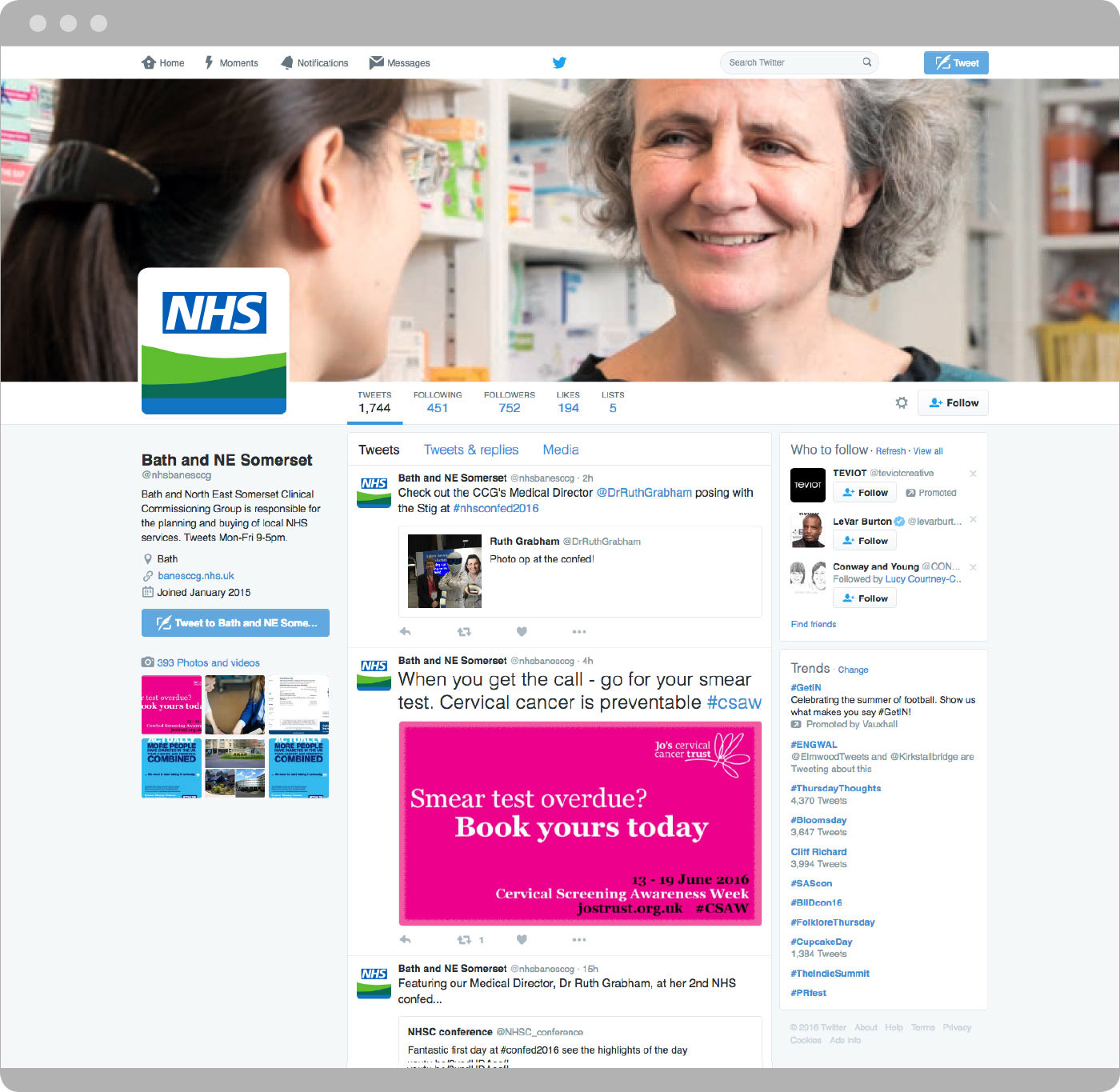
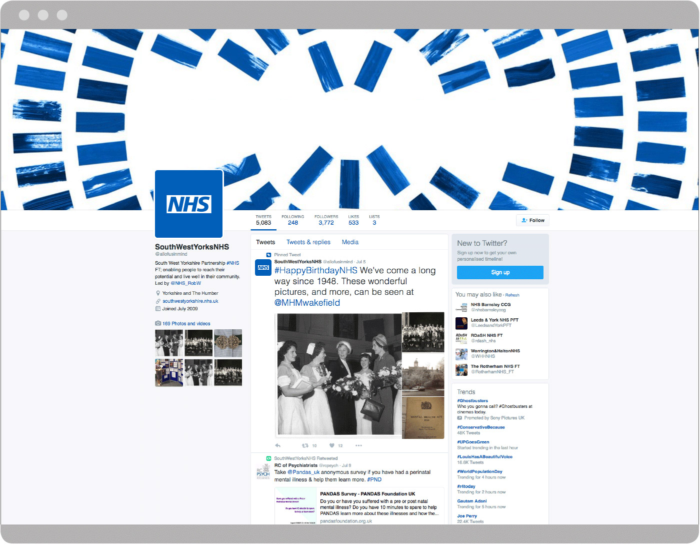
Social media accounts/profiles
There are a number of ways you can differentiate your social media account/profile. You can apply your visual style to your profile picture or cover photo. When applying a visual style/graphic device, the digital exclusion area around the NHS logo must be adhered to.
The cover photo can include the visual style/graphic device, a photographic image or be plain NHS Blue. It should not contain any text.
Your profile/account name and username are also vitally important in clarifying the account owner. They should follow NHS naming principles and be as descriptive as possible. Your profile/account name should include the full name of the organisation, service or partnership, or as much of the full name as possible. Other phrases are allowed if there is a strong rationale. These, and any abbreviations used, should make sense and enable the user to recognise the organisation. The profile text/description should include as much identifying information and as many contact details as possible.
If you have the option to include a larger ‘cover photo’ or ‘header photo’ on your profile, this should adhere to our guidelines on imagery and graphic devices.