NHS logo
The NHS logo, also known as the lozenge, is central to the NHS Identity. It is the visual representation of the values and purpose of the NHS and is the mark of quality that patients and the public look for when accessing healthcare. The NHS logo acts as a signpost to NHS organisations and services, and helps people identify information that has come from the NHS. It is the only logo that the NHS in England should use to represent itself. Wales, Scotland and Northern Ireland use their own logos for their health services.
Our research shows that the NHS logo is instantly recognised and evokes positive, rational and emotional associations of trust, confidence, security and a sense of dependability. Therefore, its position as one of the most cherished and recognised brands in England needs to be maintained and protected.
The NHS logo is protected by law. It is a UK trade mark owned by the Secretary of State for Health and Social Care. It is also protected by copyright. Only original artwork files for the NHS logo should be used. You should not attempt to recreate it yourself.
Download template artwork for the NHS logo.
When the NHS logo appears on its own, it usually signifies the NHS at a national level — ‘the NHS in England’. However, the NHS logo may also be used on its own in instances such as:
- representing a partnership of NHS organisations
- campaigns
- there is not enough space for an NHS organisational logo (see ‘Formatting your logo for digital applications: Avatars, profile pictures, icons and favicons’ in the NHS organisational logos section)
When the NHS logo is accompanied by additional descriptive text, it represents a logo for a specific NHS organisation, NHS partnership or NHS service.
In exceptional circumstances ie. for specific HM Government (HMG) or NHS led national campaigns to help, it may be necessary for the Department of Health and Social Care(DHSC) brand team to use/create a bespoke lockup.
Please see FAQ and Campaign examples pages to learn more.
Where the NHS logo appears on its own, the guidelines are as follows:
1. Leaving clear space around the NHS logo
The NHS logo should not be cluttered by other text or images appearing too close to it and should not be positioned so close to the edge of materials that it looks like an afterthought. To ensure this happens, the NHS logo has a minimum exclusion area around it.
Minimum exclusion zone for print
For print and signage applications, this is equal to the full height of the logo no matter how large it is. This ensures that the logo is always clear and legible.
Minimum exclusion zone for digital
However, digital applications (websites, apps, social media etc.) are often seen at smaller sizes that do not allow for such a large minimum exclusion area. For these applications, a smaller minimum exclusion area equivalent to half the height of the logo is accepted.
It is important to stress that these are both minimum exclusion areas. More space is preferred where it is possible and practical.
Minimum clear space limit for print
Minimum clear space limit for digital
2. The NHS logo on backgrounds
The preferred background for the NHS logo is white. However, where this is not possible, the following examples illustrate which backgrounds are, and are not, acceptable. As a general rule, you should always try to protect the overall look of the NHS Identity, so backgrounds that are white, blue or pale grey are likely to be best.
Acceptable NHS backgrounds
Blue on white
This is the core colour way. It is highly recognised by patients and the public and they strongly associate it with the NHS.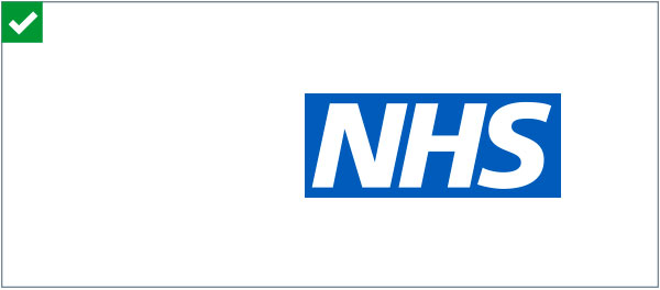
White on blue
When the NHS logo is reversed out in white against a solid background of NHS Blue it still looks distinctly NHS. NHS Blue is the only acceptable colour to reverse the NHS logo out of. You should only reverse the NHS logo out of 100% NHS Blue, never a tint.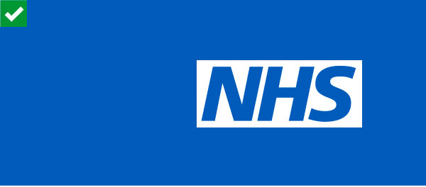
Blue on pale blue (15% tint of NHS Blue)
The NHS logo works perfectly well on a pale blue background, achieved by using a tint of NHS Blue. On pale colours like this, the NHS logo is used exactly as it would be on a white background with nothing reversed out.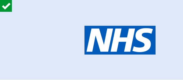
Blue on pale grey
When the NHS logo is placed on a pale grey background, it still looks clearly NHS.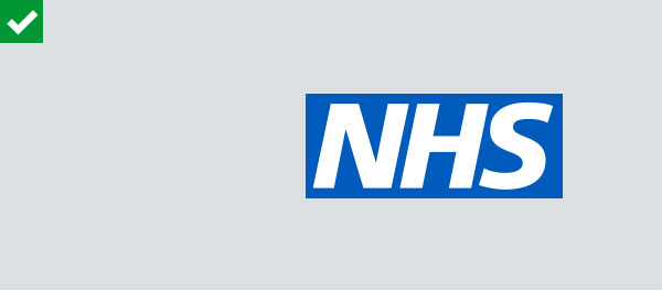
Blue on a pale photograph
The NHS logo can appear on a photograph as long as it is an uncluttered and neutral background, to ensure the NHS Blue and the logo is still clear, legible and stands out.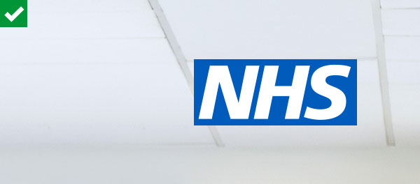
White on a blue photograph
If the NHS logo is ever shown on an uncluttered, blue photographic background, it is acceptable to reverse it out in white, the way we would on a solid NHS Blue background. This is provided the colour is a close match to NHS Blue and the NHS letters appear in solid NHS Blue.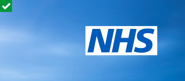
Blue on a colour photograph
If the NHS logo needs to appear on a colour photograph, the background needs to be predominantly one colour, clear and uncluttered. This is to ensure that the NHS Blue and the logo are still clear, legible and stand out. This is an example of an acceptable background image – with some variation in the background colour and image, but not sufficient to render the NHS logo unreadable.Unacceptable NHS backgrounds
Blue on an NHS support/highlight colour
The support/highlight colours in the NHS colour palette are secondary and accent colours only, so do not put the NHS logo onto blocks of these colours. The only exception to this rule is on an ambulance which is painted in high visibility yellow.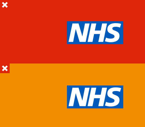
White out of colours other than NHS Blue
The NHS logo cannot be reversed out of any colour other than NHS Blue. This is because NHS Blue is the colour that the public expect, and recognise, to represent the NHS. NHS Blue must always be present, either within the NHS logo or as a background to it.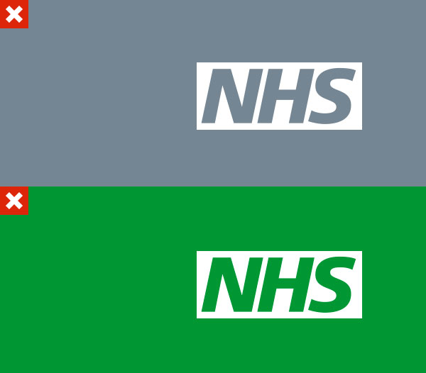
Blue on dark NHS palette colours
Black and dark grey in the NHS colour palette are for body copy and type, depending on the background and application. They are not for use as background colours as this would create a very sombre look that undermines the clarity and freshness of the NHS Identity.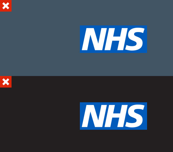
Blue on cluttered backgrounds
Photographic or patterned backgrounds that are too cluttered or detailed will compromise the legibility of the NHS logo. If you need to place the logo over images (usually in the top right corner), ensure the space is clear enough so that the logo can still be easily seen and stands out.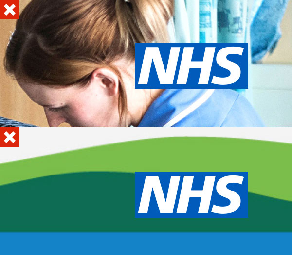
Blue on the same background colour
The NHS logo gets completely lost if it is used in NHS Blue on a background of the same colour. The NHS logo should be reversed out in white against the NHS Blue. Do not be tempted to put an outline around the NHS logo to make it stand out.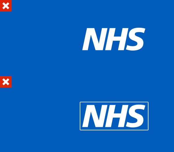
Non-NHS backgrounds
Blue on a partner’s brand colour
When you are working in partnership with an organisation that is outside the NHS, the NHS logo may need to appear against the partner's brand colour. Whilst this may not be a colour in the NHS palette, if they are the lead organisation in the partnership and the NHS is in a supporting role, their brand identity should dominate. The NHS Blue in the logo helps to maintain recognition of the NHS Identity. However, the background needs to provide enough contrast so that the logo is clear and legible and the NHS Blue stands out. If this isn’t possible, the logos need to appear on a white banner. If you are working in equal partnership with a non-NHS organisation, you would use a neutral visual style, where neither the NHS nor the partner organisation’s identity would dominate. In this case, you would use a white or pale background colour.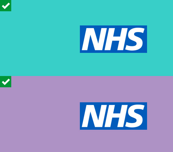
Printing in one colour
If you are printing in one colour, the NHS logo can be reproduced in NHS Blue or in black. No other colours are permitted. You can’t reverse the NHS logo out of black.
3. Size and positioning
Since its introduction, the NHS logo has always appeared top right, and this is where patients and the public expect to see it. Therefore, with the exception of digital applications, the logo should always appear in the top right of materials (when the NHS is leading the work/communication).
The following shows the relative sizes and margins for the NHS logo on standard print, advertising and digital formats. Any other formats should be sized proportionally, or should replicate the size and margin of the closest format shown here. For example, a square A4 format (210mm x 210mm) should use the size and margin guidelines for A4. Please note there are different sizing guidelines for NHS organisational logos. This is because they are deeper and therefore the NHS logo height needs to be proportionally smaller.
Standard print sizes
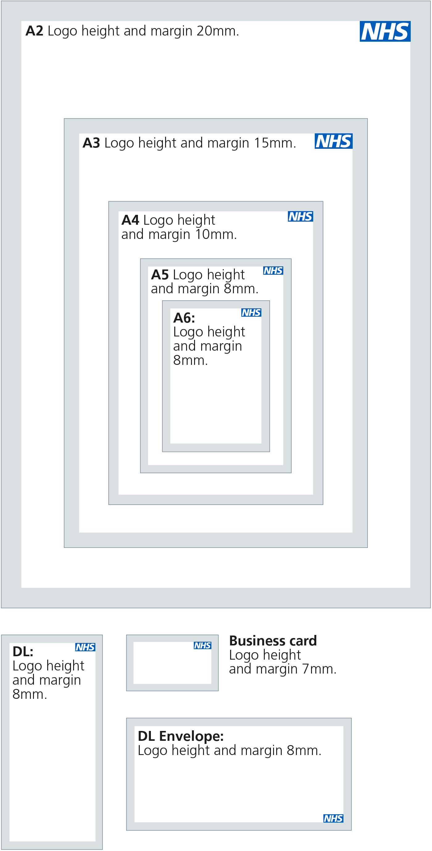
The following summarises NHS logo and margin sizes for standard print formats:
A2 (420 x 594mm) Logo and margin size = 20mm
A3 (297 x 420mm) Logo and margin size = 15mm
A4 (210 x 297mm) Logo and margin size = 10mm
A5 (148 x 210mm) Logo and margin size = 8mm
A6 (105 x 148mm) Logo and margin size = 8mm
DL (99 x 210mm) Logo and margin size = 8mm
DL Envelope (110 x 220mm) Logo and margin size = 8mm
Business Card (55 x 90mm) Logo and margin size = 7mm
Typical advertising poster sizes
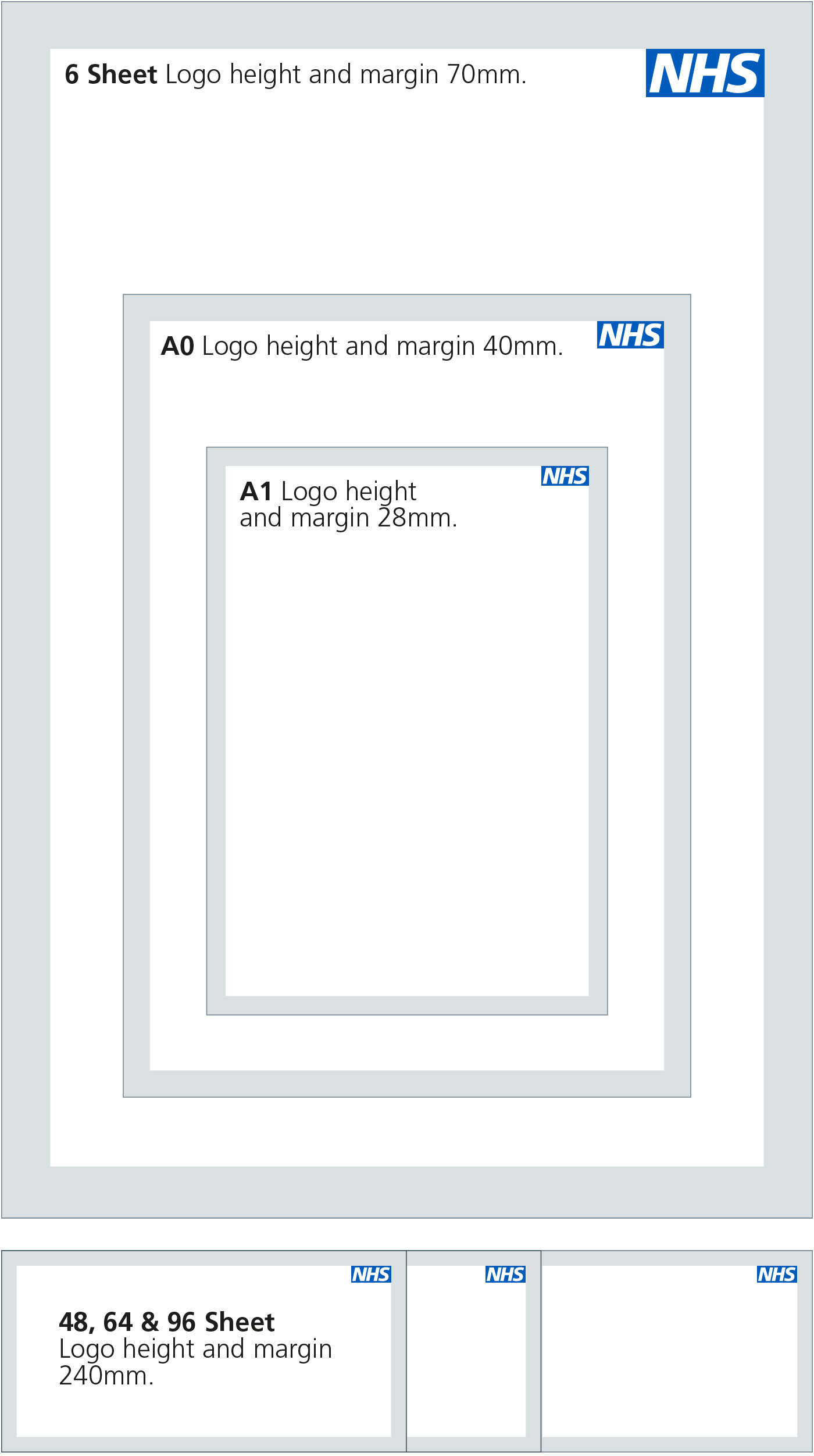
The following summarises NHS logo and margin sizes for typical advertising poster formats:
96 sheet (12,192 x 3048mm) Logo and margin size = 240mm
64 sheet (8,128 x 3048mm) Logo and margin size = 240mm
48 sheet (6,096 x 3048mm) Logo and margin size = 240mm
6 sheet (1,200 x 1800mm) Logo and margin size = 70mm
A0 (841 x 1189 mm) Logo and margin size = 40mm
A1 (594 x 841 mm) Logo and margin size = 28mm
Digital formats
The following shows the NHS logo height and margin sizes for typical desktop and mobile screen sizes.
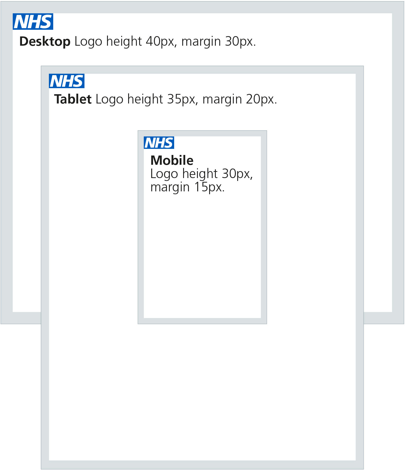
Desktop (>1000px wide) Logo height = 40px and margin size = 30px
Tablet (>600px and <1000px wide) Logo height = 35px and margin size = 20px
Mobile phone (<600px wide) Logo height = 30px and margin size = 15px
The minimum size that the NHS logo can appear in digital applications is 30px high. It is important to stress that this is a minimum. The only exception to this is when designing favicons for web browsers, as they can typically be as small as 15px square.
Where recommended margins cannot be achieved, the minimum digital exclusion zone of half the NHS logo height should be observed.
4. One NHS logo on a page
There should never be more than one NHS logo on a page. Duplication looks untidy and dilutes the strength and impact of the NHS Identity. We have specific guidance on when two or more NHS organisations are working in partnership.
5. Using the NHS logo within text
The NHS logo must not be embedded in a line of text as a substitute for the letters ‘NHS’.