Fonts
Typeface is a key element of any organisation’s identity. When the NHS Identity was introduced in 1999, Frutiger was chosen as the primary NHS font and has been in place ever since. Frutiger is a contemporary and flexible sans serif font, which was designed to be clear and easy to read at a distance and in small sizes. It still achieves this objective and has become recognised as the clean, simple typeface which people associate with the NHS.
The core NHS font is Frutiger and the secondary font is Arial. These fonts should be used for all NHS communications. No other fonts should be used, even if your NHS communications are aimed at a specific target audience (e.g. children). The consistent use of permitted fonts achieves the unified and uniform approach that our patients and public want from the NHS. The only exception is foreign language fonts.
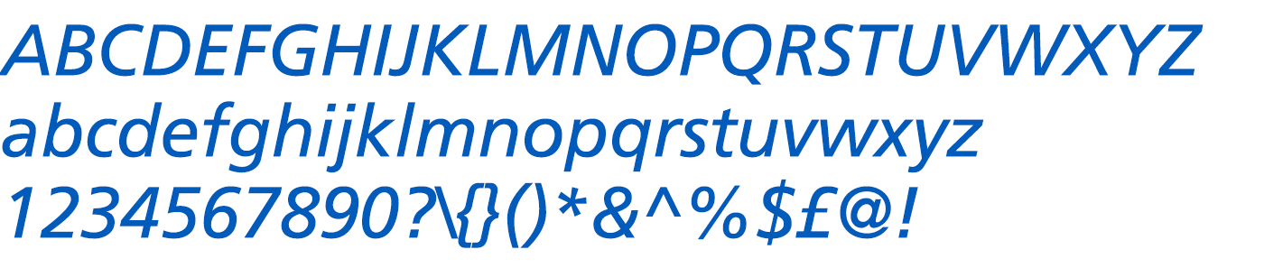
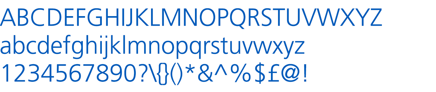
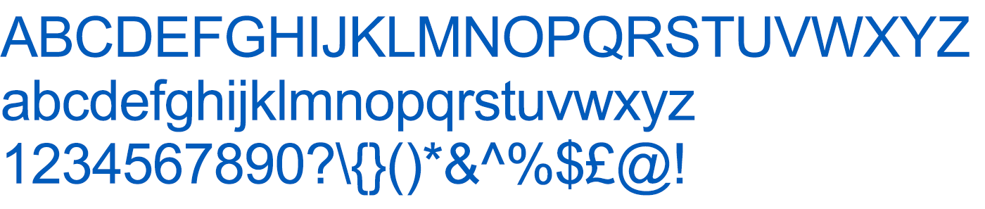
Core NHS font: Frutiger
NHS England secured a perpetual licence for Frutiger in three weights on behalf of all NHS organisations within England in December 2024. NHS organisations within England are no longer required to purchase separate licences for Frutiger 65 Bold, Frutiger 55 Roman, and Frutiger 45 Light for either on and offline use.
It should be noted that Frutiger 45 light is not licenced for usage in apps and if required for app usage a separate licence must be purchased via Monotype or commercial font resellers. The use of Frutiger Italic is also not covered by the licence. However, the three licenced weights, as set out in the guide below, are appropriate for the majority of uses. Online, we suggest avoiding using italics because it is less accessible.
To benefit from this licence and to receive the font files if required, NHS organisations in England must submit an application to NHS England to become sub-licence holders. Full details of this process and the online application form are available at NHS Digital Service Manual – Use the NHS Frutiger font.
Frutiger 65 Bold: Perfect for titles and text that needs to grab attention.
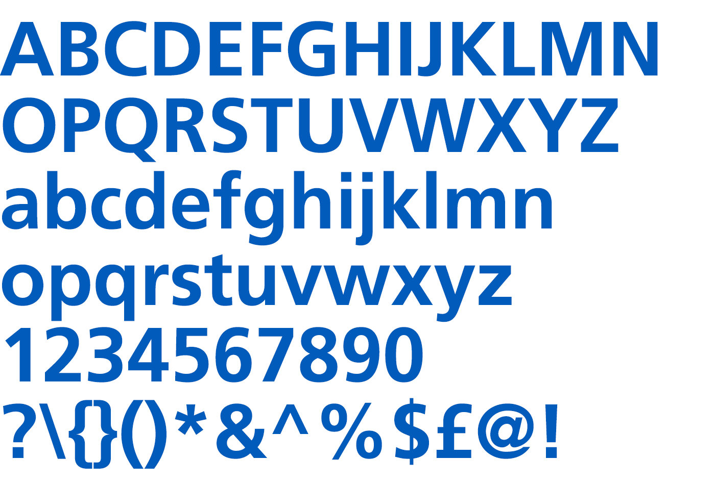
Frutiger 55 Roman: Ideal for body copy.

Frutiger 56 Roman Italic: For traditional italic highlighting (offline only. Separate licence required).
Frutiger 45 Light: Good for very large titling and over-sized intro copy (separate licence required for app usage).
Frutiger in application
These sample sign applications show how Frutiger can be used to create a clear hierarchy that is very easy to read and understand.
- Frutiger Bold is used for the main titles.
- Frutiger Roman is used for ‘Welcome to’ to give contrast.
- Frutiger Roman is used for the smaller copy, next to the bold ‘No A&E’.
- The logo is an NHS organisational logo created following a set template.
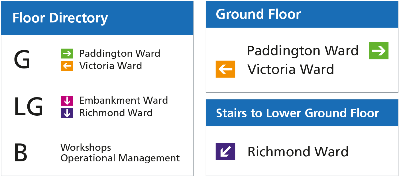
External signage

These sample internal signs further demonstrate how clear Frutiger is when it is used to convey simple, directional information.
- Frutiger Bold is used for the main floor titles.
- Frutiger Roman is used for all other copy to give contrast.
Internal Signage
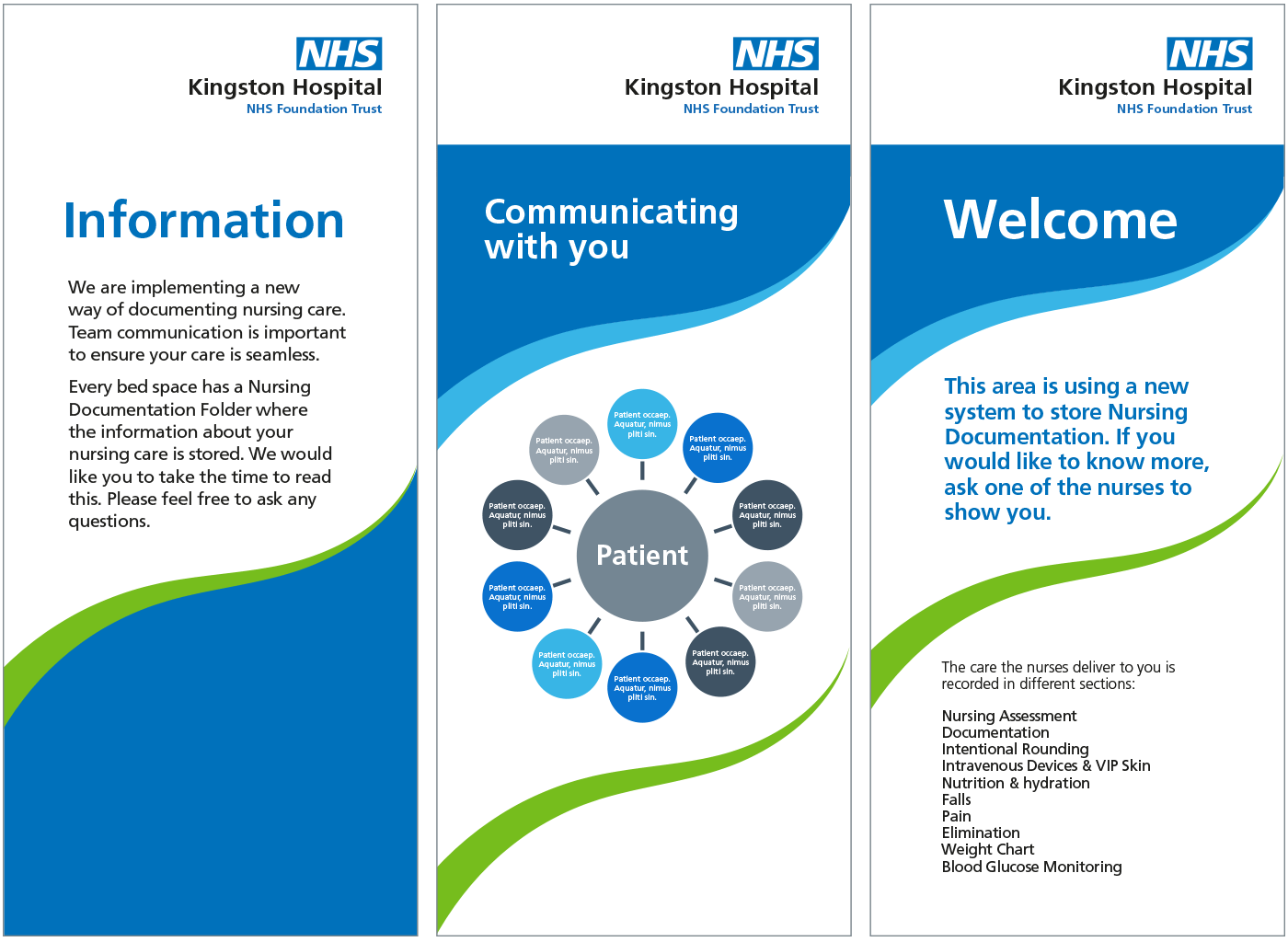
These leaflet examples demonstrate how a modest number of weights can create a very clear typographic hierarchy that helps the reader understand what’s going on, even when there is quite a lot of copy.
- Frutiger Bold is used for the main titles and highlights.
- Frutiger Roman is used for the body copy and lists.
- Frutiger Light is used to lead into the list on the right hand example.
Patient information leaflet
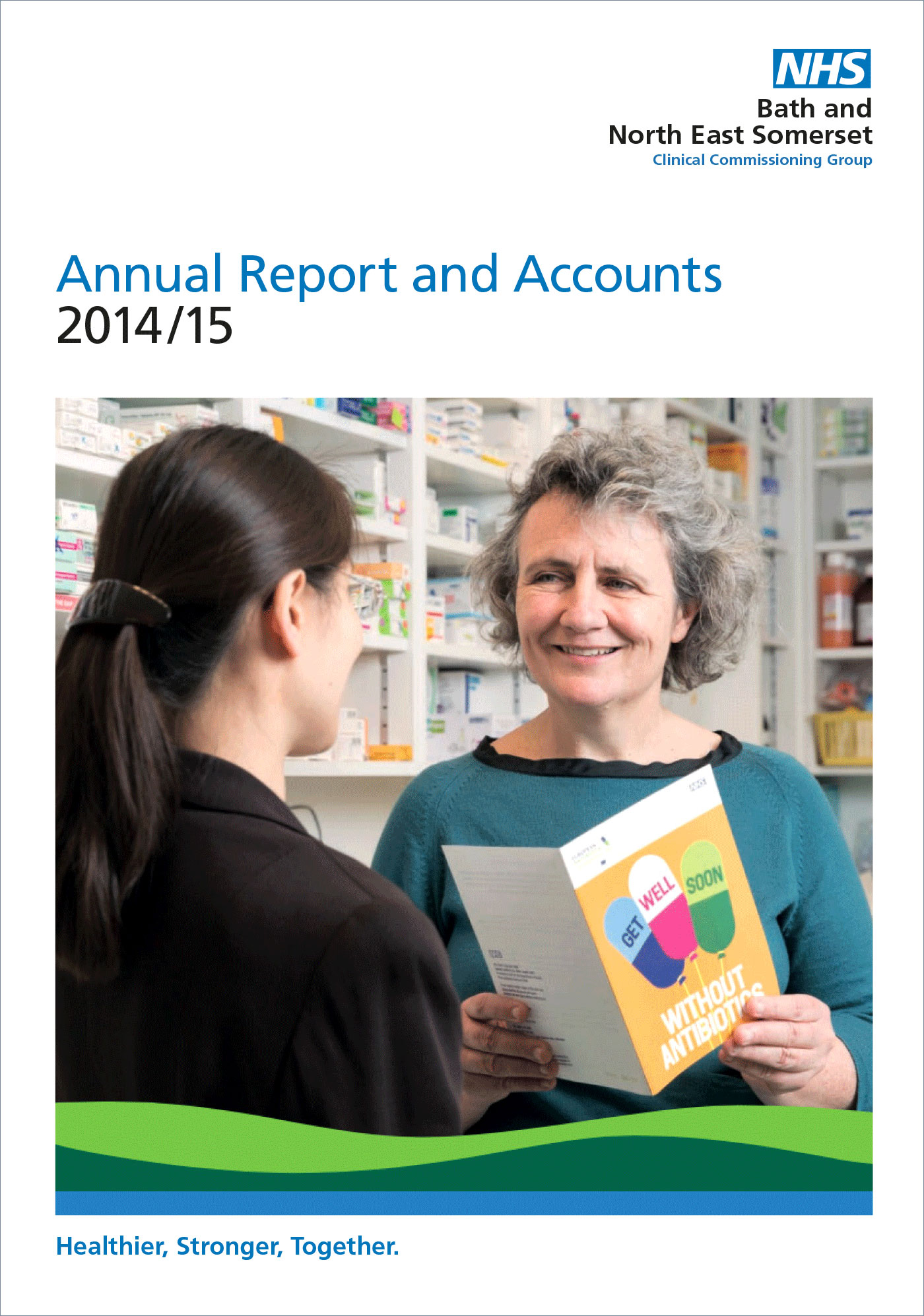
The following sample is an A4 Annual Report. The title is in Frutiger Roman to give a light, accessible look. If the title was in Frutiger Bold at the size shown, this would overwhelm the image and produce a much heavier look.
- Frutiger Roman is used for the title copy.
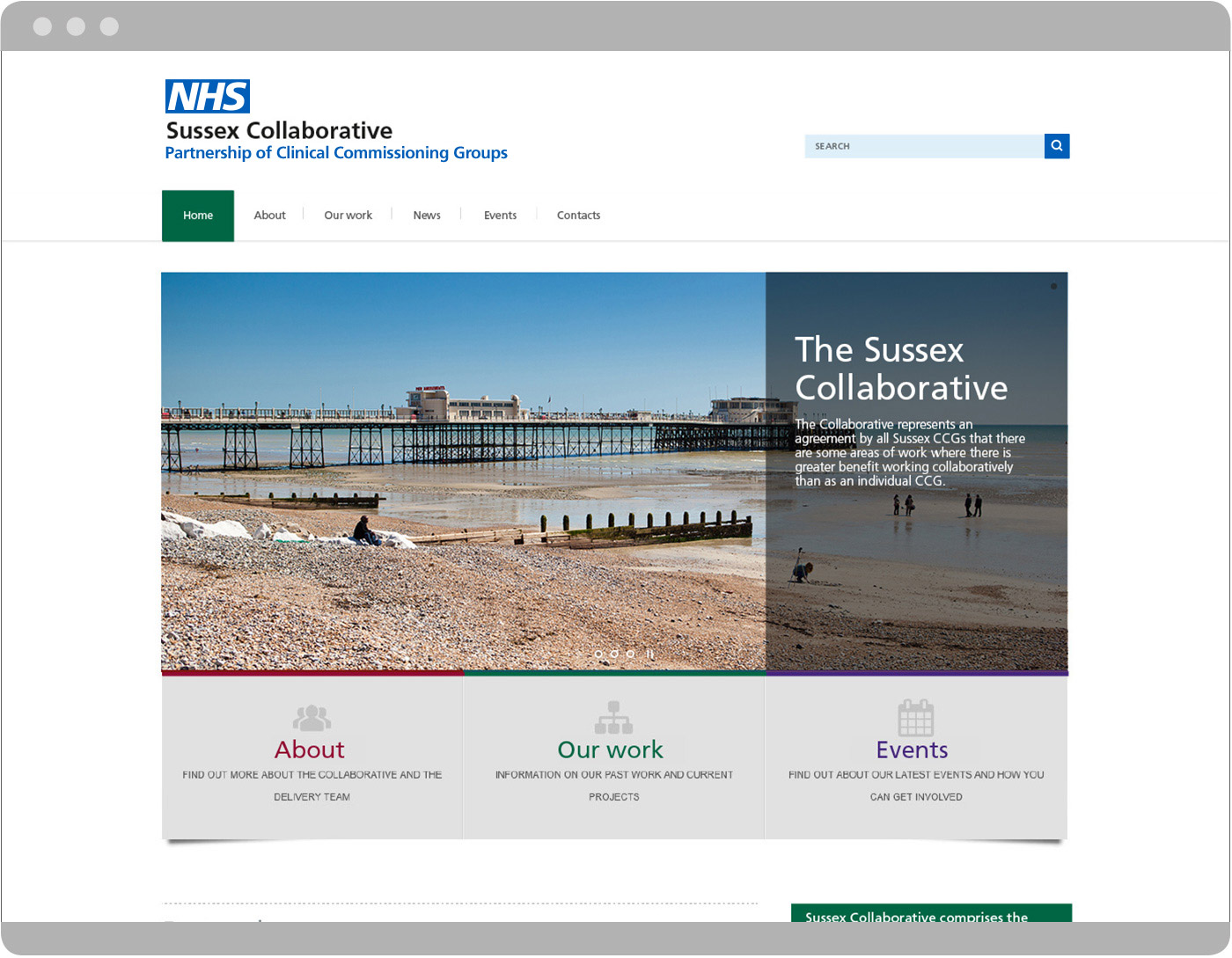
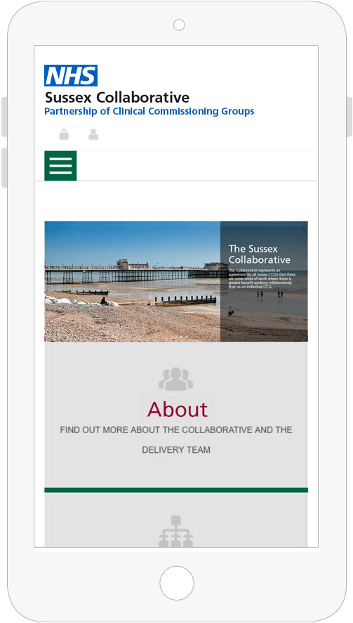
The following examples show the desktop and mobile layouts of a responsive website. In both cases a hierarchy is created between different areas using different weights and sizes.
- Frutiger Bold is used for titles and headings.
- Frutiger Roman is used for body copy and lists.
- Frutiger Light is used for supporting information.
Desktop layout
Mobile layout
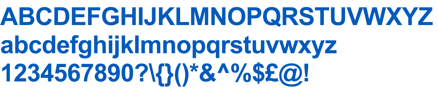
Secondary NHS font: Arial
The NHS also has a secondary font, Arial, for use when Frutiger is not available. Arial is also an accessible sans serif font with good clarity and legibility. It is a very widely available typeface that all users should have easy access to. Given its availability, Arial will generally be used for internally produced documents like letters, reports and PowerPoint presentations.
Arial Regular
Arial Bold
Arial in application
Arial doesn’t have the same level of character and range of weights as Frutiger, nor does it have the same associations with the NHS, because of its wide availability and use by a broad range of organisations. Therefore, it is preferable to use Frutiger where possible and available.
However, the practical advantages and cost effectiveness of Arial mean that is a perfectly workable and effective font.
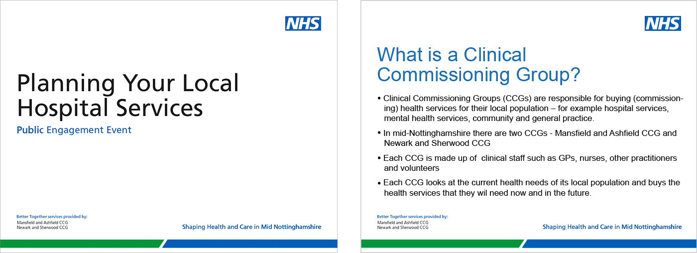
The following example of presentation slides show how Arial can be used to create a clear hierarchy with just two weights.
- Arial regular is used for main titles and body copy.
- Arial bold is used for highlights and straplines.
PowerPoint presentation slides
Foreign language fonts
The NHS should to be accessible to all people at all times, to provide quality and equality of service and experience. To do this, the language needs of our local communities need to be taken into consideration and there will be occasions when foreign language fonts are required.
A local specialist translator and/or typesetter will be able to advise you on styles for foreign language translation and on commonly used fonts. Use a font that is clear and uncomplicated ensuring that it meets accessibility requirements. If possible, test it out with your target audience before going to print or publishing online.
Remember that a text is more legible if it is:
- non-italic
- against a background which is in strong contrast to the type.
Accessibility
The implementation guidance for the Accessible Information Standard gives general advice on producing accessible documents. The Web Content Accessibility Guidelines (WCAG) 2.0 covers a wide range of recommendations for making web content more accessible.