Organisational logos
Patients and the public see the NHS as a single, national, unified service and expect and want the NHS Identity to be applied in a consistent and uniform way – it reassures them that they can rely on the quality of healthcare being provided wherever they access it.
There are currently four main types of NHS organisation. They are:
- National NHS organisations
- NHS Integrated Care Boards
- NHS Foundation Trusts and NHS Trusts
- Hosted or non-statutory NHS organisations and entities (e.g.Clinical Senates, Strategic Clinical Networks).
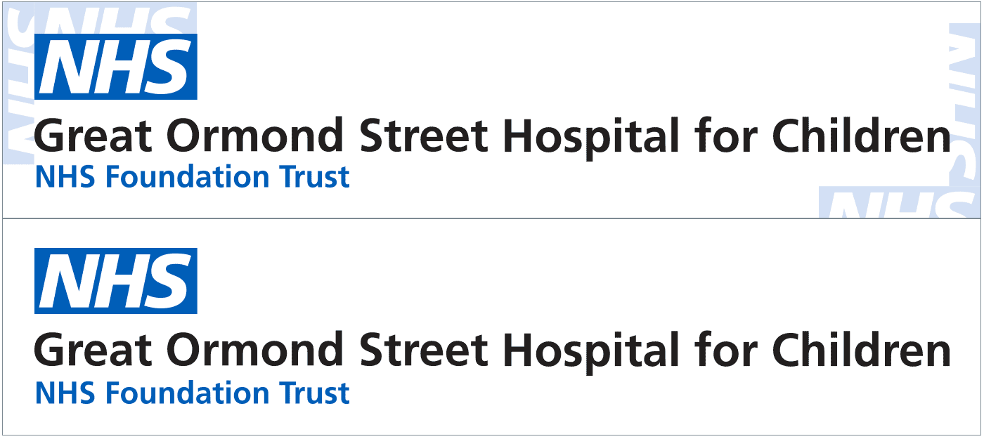
A standard format has been introduced for all NHS organisational logos to ensure that patients and the public see the NHS presented in a consistent, coherent and professional way.
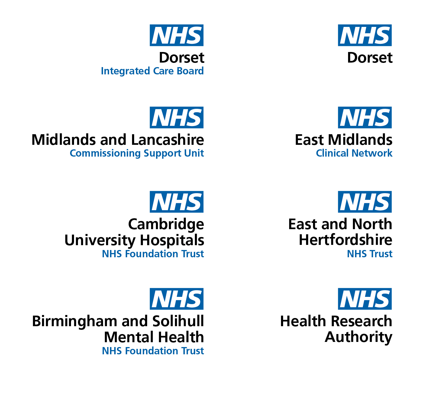
NHS organisational logos are made up of the following components:
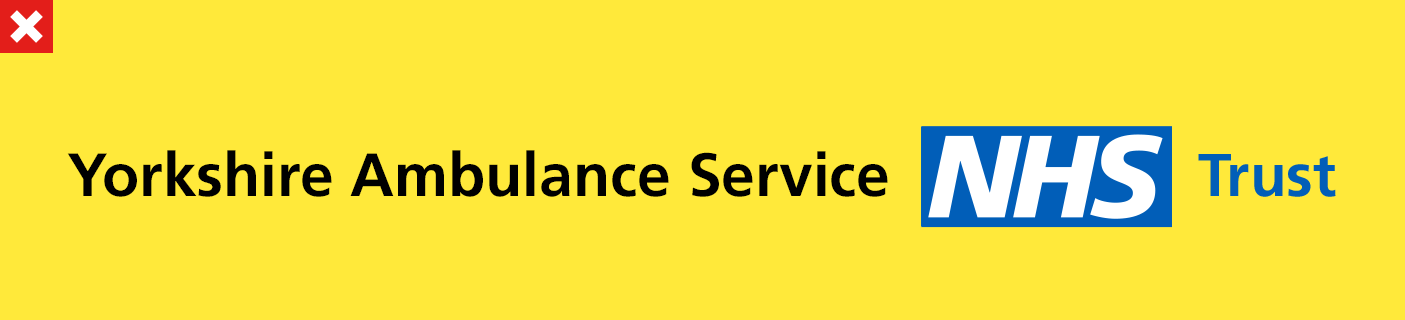
- the NHS logo – this is the most important part of the organisational logo to patients and the public.
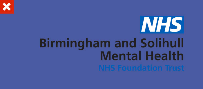
- your organisation’s name – this must be the full and correct legal name. Patients and the public view this as the second most important part of the logo, so it is in larger, black text to make it prominent.
- your organisation’s descriptor – (e.g. NHS Foundation Trust) This is the least important part of the logo to patients and the public, so it is less prominent, in smaller, blue text. National organisations do not have an organisational descriptor.
If your organisation ever needs to change its name, you will be responsible for making changes to your NHS organisational logo once your new name is approved. To assist with this, we have created a template which shows how the artwork for NHS organisational logos should be created. Artwork for your NHS organisational logo should be held by, and supplied from, a central point in your organisation to ensure it is always reproduced correctly and consistently.
Download template artwork for the NHS organisational logo.
The NHS logo, which forms part of your NHS organisational logo, is protected by law. It is a UK trade mark owned by the Secretary of State for Health and Social Care. It is also protected by copyright. You can only use the NHS logo in your NHS organisational logo as shown in the template below.
Only original artwork for the NHS logo should be used. You should not attempt to recreate the NHS logo yourself.
1. Formatting your logo
Ranged right logo
Start by creating an A4 landscape page in professional design software that can create vector files – this ensures that all relative sizes match. Create type boxes at the sizes and positions shown above. Set the type in the typefaces, weights and colours shown above:
Organisation’s name – 60pt Frutiger Bold, ranged right on 61pt leading, in black.
Organisation’s descriptor – 40pt Frutiger Bold, ranged right on 50pt leading, in NHS Blue.
Read more about the Frutiger typeface
If your NHS organisation’s name is longer in width than the A4 landscape page, it will need to run onto two lines (see below for more information). If your organisation’s name runs longer than two lines please visit contact us to request the adapted template.
Add the NHS logo in the size and position shown and the organisational logo is finished.
If you then convert your type to paths and ensure the NHS organisational logo is a vector graphic you will have a complete, grouped vector graphic that can be resized, retaining all of the relative proportions.
Your completed logo will look like this:
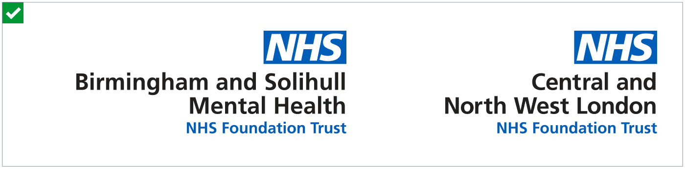
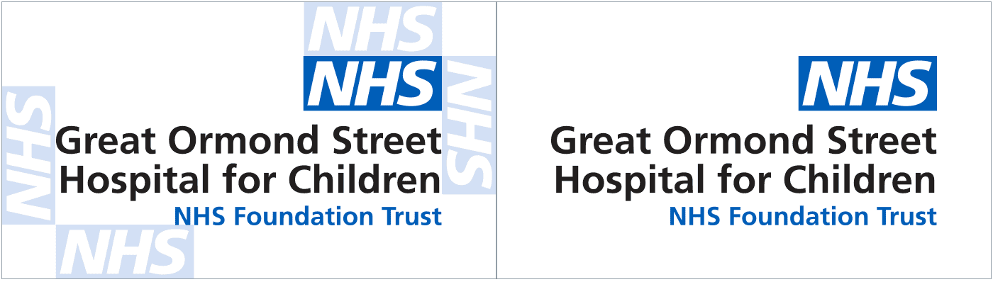
The following examples show how a standard format for NHS organisational logos brings consistency, regardless of the length of NHS organisations’ names and the length, or even absence, of organisational descriptors.
This achieves the uniform look that patients and the public expect from a unified National Health Service.
Organisational logos
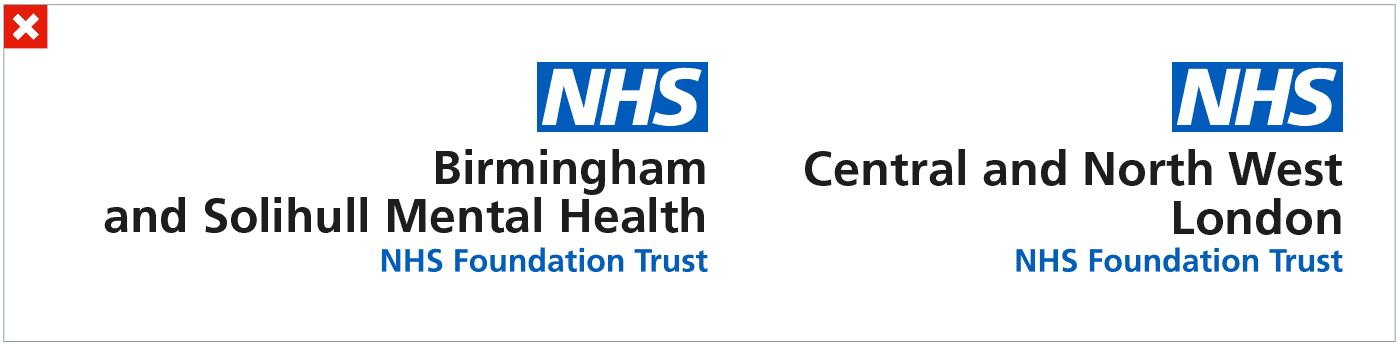
Splitting an organisation’s name across two lines
Some NHS organisations’ names are too long to fit onto a single line and they have to run onto two lines. If your organisation ever needs to change its name, you should use discretion to decide where best to split your name depending on what makes most sense and what looks visually balanced.
Good examples
Bad examples
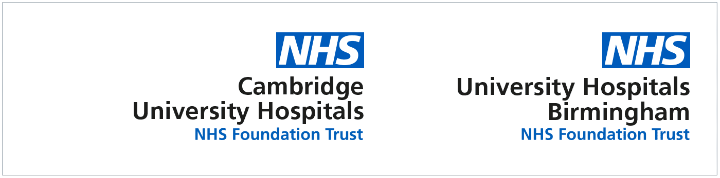
Where the word ‘University’ is included in an NHS organisation’s name, it should not be moved into the NHS organisation’s descriptor. When permission is granted to add ‘University’ to an existing organisation’s name, the position should be carefully considered. Ideally ‘University’ would be placed at the start of the name. When it is placed at the end of the name, the prominence of the word could give the impression of the title of a university rather than an NHS Foundation Trust or NHS Trust.
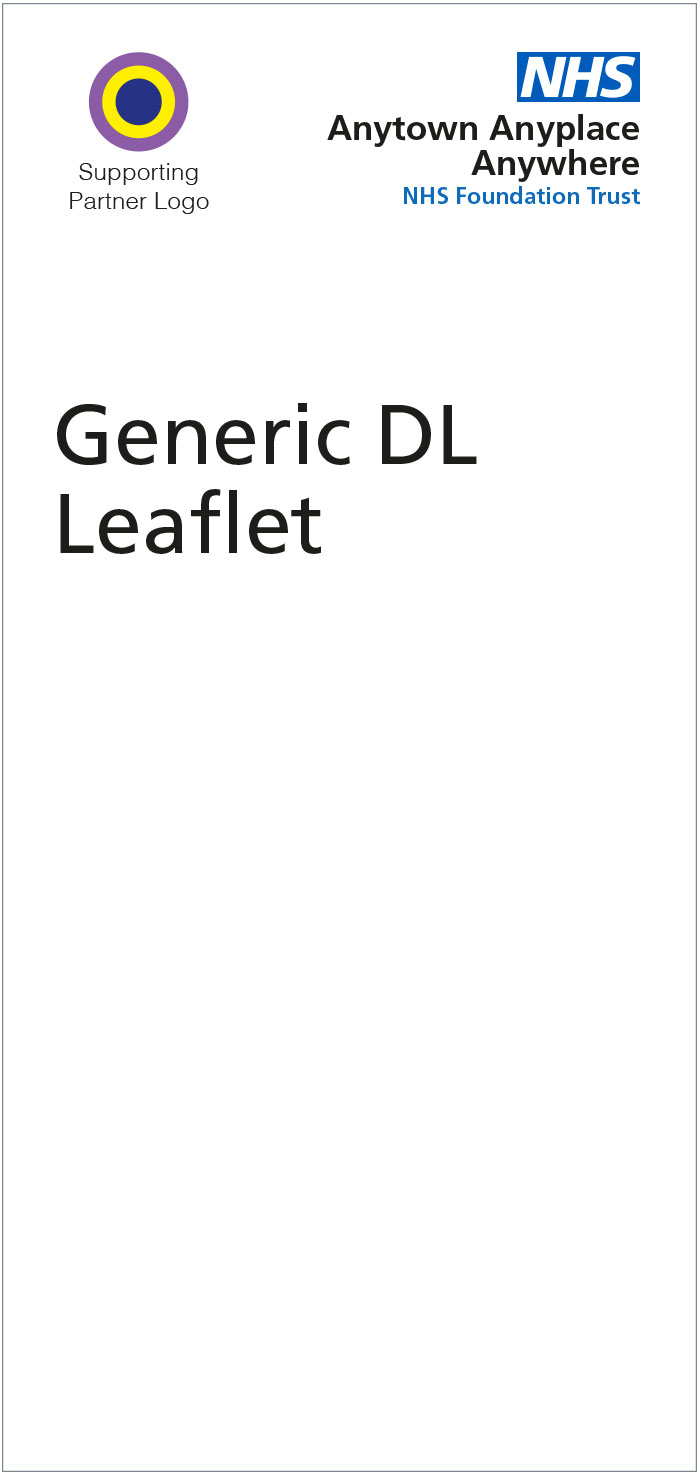
If your NHS organisational logo is usually formatted on one line, and needs to appear alongside a partner logo on a narrow format (e.g. DL size), it may need to be split across two lines.
If you decide that a stacked logo is more appropriate, you should create this ensuring that all the relative sizing and formatting in the logo template above is adhered to. Again, you should use discretion to decide where best to split the name over the two lines. This will depend on how it is best to split your organisation’s name and also what looks visually best.
2. Formatting your logo for digital
When creating artwork for use in digital applications the rules are exactly the same as above, with the exception of having the option to range the NHS logo and type to the left, as shown in the image below.
Websites
When applying your NHS organisational logo, use the full version including your full name and descriptor, where there is one. Due to the height restriction on a website banner, if necessary, you may amend your logo so that your name appears on one line. Your descriptor will still go below. (See exceptions below for where there is insufficient space for your full logo to appear.)
If you choose to do this, create the logo using the template provided, ensuring all relative sizing and formatting is adhered to.
Social media and apps
Using the NHS logo is an important way of signifying that a social media account or an app belongs to an NHS organisation.
Profile pictures, avatars and icons
Profile pictures, avatars and icons can range in size from 20px to over 1000px square (and sometimes appear as circles). They do not usually provide sufficient space for NHS organisations to display their full logo. Therefore, you should use the national NHS logo on its own.
You should distinguish your social media account and profile picture from other NHS organisations through the use of other naming principles and/or graphic devices.
Although you can use the national NHS logo on its own for icons, your full organisational logo should be applied to app loading/startup screens, login screens, the home screen or a combination of all three. The national NHS logo should not appear on its own anywhere within app pages.
You should also distinguish your social media account and apps from other NHS organisations through the use of other naming conventions and/or graphic devices.
3. Leaving clear space around your logo
NHS organisational logos should not be cluttered by other text or images appearing too close to them and should not be positioned so close to the edge of materials that it looks like an afterthought. To ensure this happens, all NHS logos have a minimum exclusion area around them.
Minimum exclusion zone for print
For print and signage applications, this is equal to the full height of the NHS logo (applied all the way around the whole organisational logo), no matter how large it is. This ensures that the organisational NHS logo is always clear and legible.
Minimum exclusion zone for digital
Digital applications (websites, apps, social media etc.) are often seen at smaller sizes that do not allow for such a large minimum exclusion area. For these applications, a smaller minimum exclusion area equivalent to half the height of the NHS logo is accepted.
It is important to stress that these are both minimum exclusion areas. More space is preferred where it is possible and practical.
4. Logos on backgrounds
The key principles for this are the same as for the NHS logo. Please read the full guidelines on applying the NHS logo to different backgrounds.
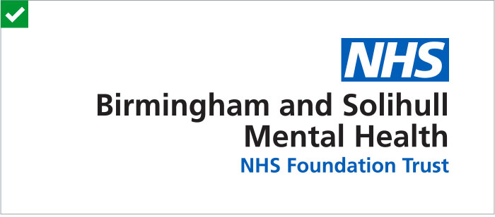
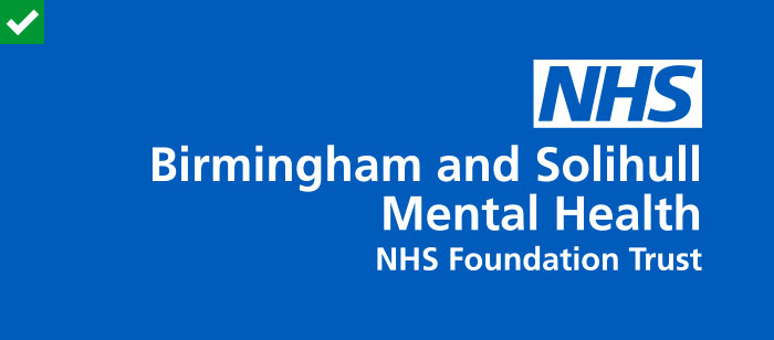
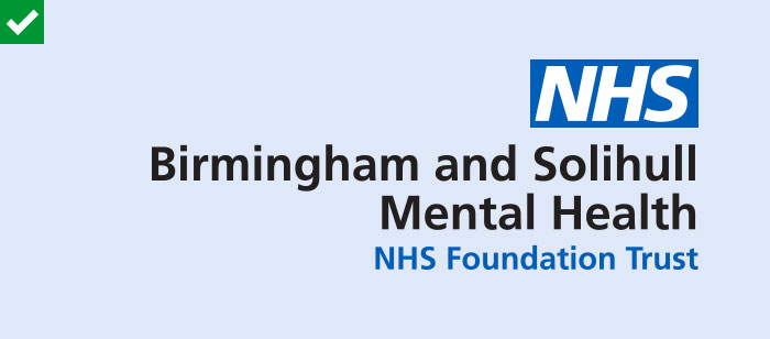
The examples below show how the text for your organisational logo should appear in its original format, with your organisation’s name in black and your descriptor in NHS Blue. Your organisational logo can only be reversed out in NHS Blue, in which case the text appears in white. The only exceptions are on dark coloured uniforms and on some vehicles.
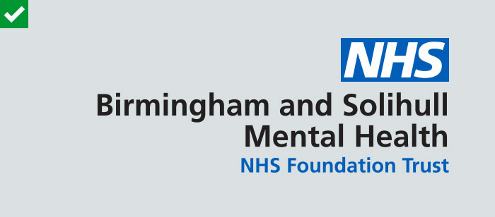
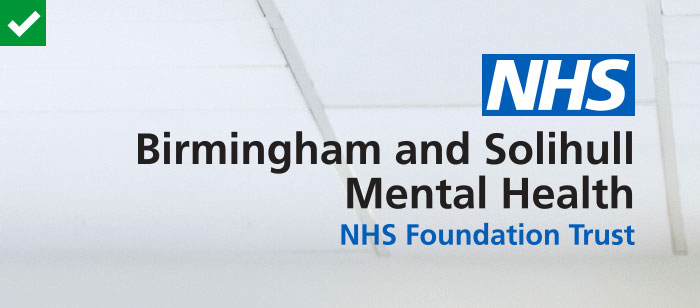
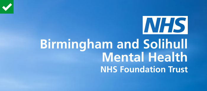
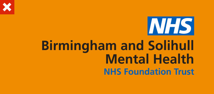
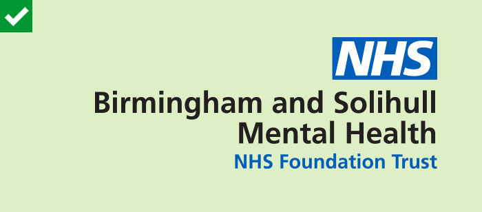
Acceptable NHS backgrounds
The original format of your organisational logo is designed to work best against NHS core colour backgrounds, such as white, pale grey or pale blue. Your organisation’s logo can only be reversed out in NHS Blue, in which case the text appears in white. If your NHS organisational logo is ever shown on an uncluttered, blue photographic background, it is acceptable to reverse it out in white, the way you would on a solid NHS Blue background, provided the blue is a close match and the NHS letters appear in a solid blue colour.
Blue on white
White on blue
Blue on pale blue (15% tint of NHS Blue)
Blue on pale grey
Blue on a pale photograph
White on a blue photograph
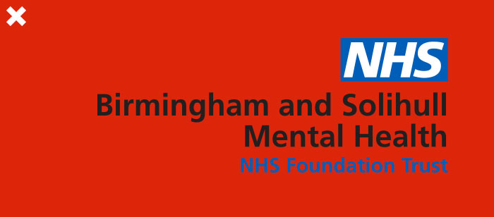
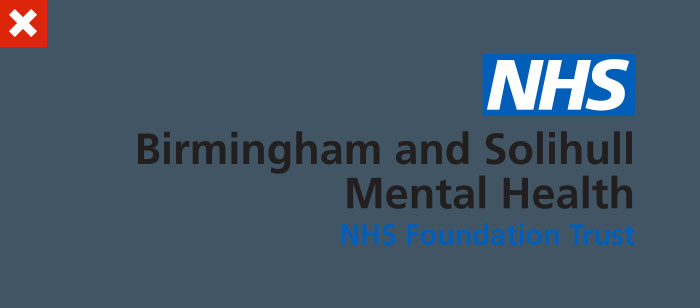
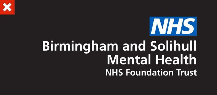
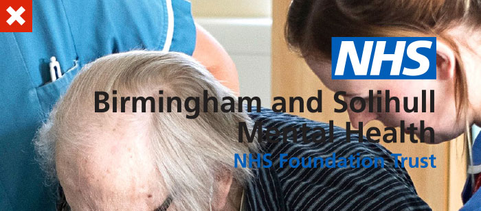
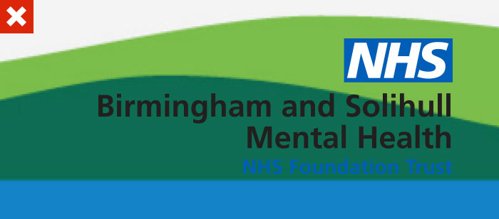
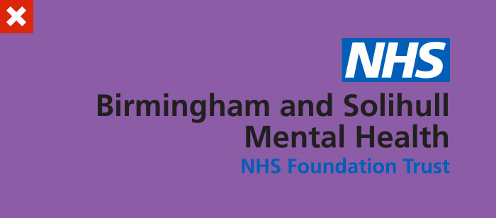
Unacceptable NHS backgrounds
The highlight colours in the NHS colour palette are for use as accent colours only, so do not put your NHS organisational logo onto blocks of the highlight colours. The only exception to this rule is on an ambulance which is painted in Euro Ambulance yellow. See our guidelines on colours for more information.
Dark grey and black, or photographic or patterned backgrounds that are too cluttered or detailed will compromise the legibility of your NHS organisational logo. If you need to place the logo over images, ensure the space is clear enough so that all parts of the organisational logo can still be easily seen, stand out and the text is legible in the original formatted colours.
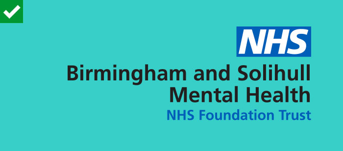
Non-NHS backgrounds
When you are working in partnership with an organisation which is outside the NHS, your NHS organisational logo may need to appear against the partner’s brand colour. Whilst this may not be a colour in the NHS palette, if they are the lead organisation in the partnership and the NHS is in a supporting role, their brand identity should dominate. The NHS Blue in the logo helps to maintain recognition of the NHS Identity. The key principle is that the background colour needs to provide enough contrast so that all parts of the NHS organisational logo are clear and legible. The NHS Blue of the logo needs to stand out against the background colour and the text needs to appear in its original format of black and blue. If this isn’t achievable, the logo needs to appear on a white banner. If you are working in equal partnership with a non-NHS organisation, you would use a neutral visual style, where neither the NHS nor the partner organisation’s identity would dominate. In this case, you would use a white or pale background colour.
5. Size and positioning
Since the NHS Identity was introduced, NHS organisational logos have always appeared top-right, and this is where patients and the public expect to see them. They are ranged right which lend themselves to this position. Therefore, with the exception of digital applications (websites, apps, social media etc.) your NHS organisational logo should always appear in the top right of materials (when the NHS is leading the work/communication).
The following shows the relative sizes and margins for your NHS organisational logo on standard print, advertising and digital formats. The sizing for your organisational logo is based on the height of the NHS logo. By NHS logo we mean the blue box containing the white NHS letters. Any other formats should be sized proportionally, or should replicate the size and margin of the closest format shown here. For example, a square A4 format (210mm x 210mm) should use the size and margin guidelines for A4. Please note when using the national NHS logo on its own, please refer to the guidelines for the NHS logo. This is because it’s not as deep as your NHS organisational logo and therefore the height needs to be proportionally smaller.
Standard print sizes
The following summarises the NHS logo height and margin sizes for standard print formats.
A2 (420 x 594mm) Margin 20mm. NHS logo height 18mm.
A3 (297 x 420mm) Margin 15mm. NHS logo height 13mm.
A4 (210 x 297mm) Margin 10mm. NHS logo height 9mm.
A5 (148 x 210mm) Margin 8mm. NHS logo height 7mm.
A6 (105 x 148mm) Margin 8mm. NHS logo height 7mm.
DL (99 x 210mm) Margin 8mm. NHS logo height 7mm.
DL Envelope (110 x 220mm) Margin 8mm. NHS logo height 7mm.
Business Card (55 x 90mm) Margin 6mm. NHS logo height 6mm.
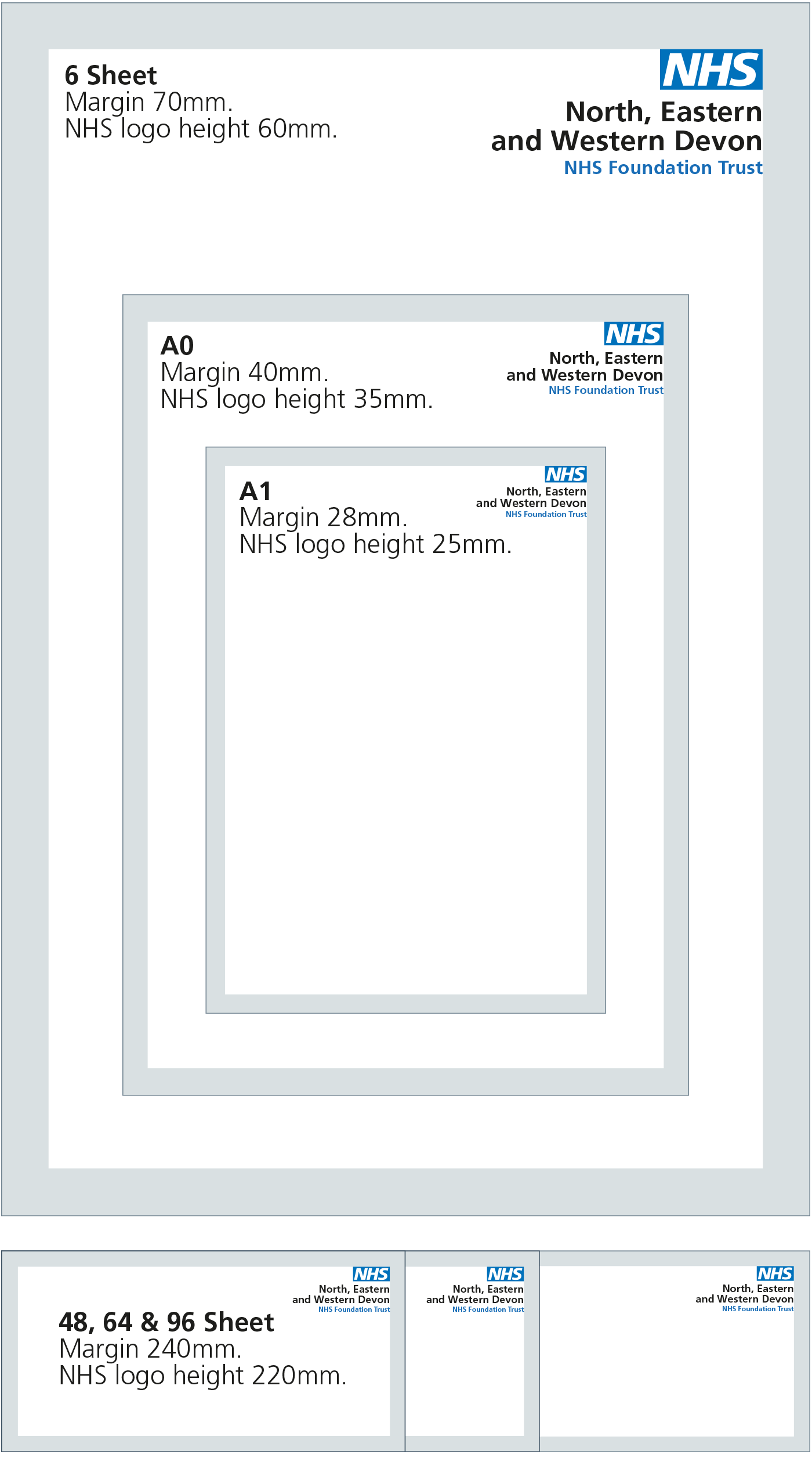
Typical advertising poster sizes
The following summarises NHS logo height and margin sizes for typical advertising poster formats:
A1 (594 x 841 mm) Margin 28mm. NHS logo height 25mm.
A0 (841 x 1189 mm) Margin 40mm. NHS logo height 35mm.
6 sheet (1,200 x 1800mm) Margin 70mm. NHS logo height 60mm.
48 sheet (6,096 x 3048mm) Margin 240mm. NHS logo height 220mm.
64 sheet (8,128 x 3048mm) Margin 240mm. NHS logo height 220mm.
96 sheet (12,192 x 3048mm) Margin 240mm. NHS logo height 220mm.
Digital formats
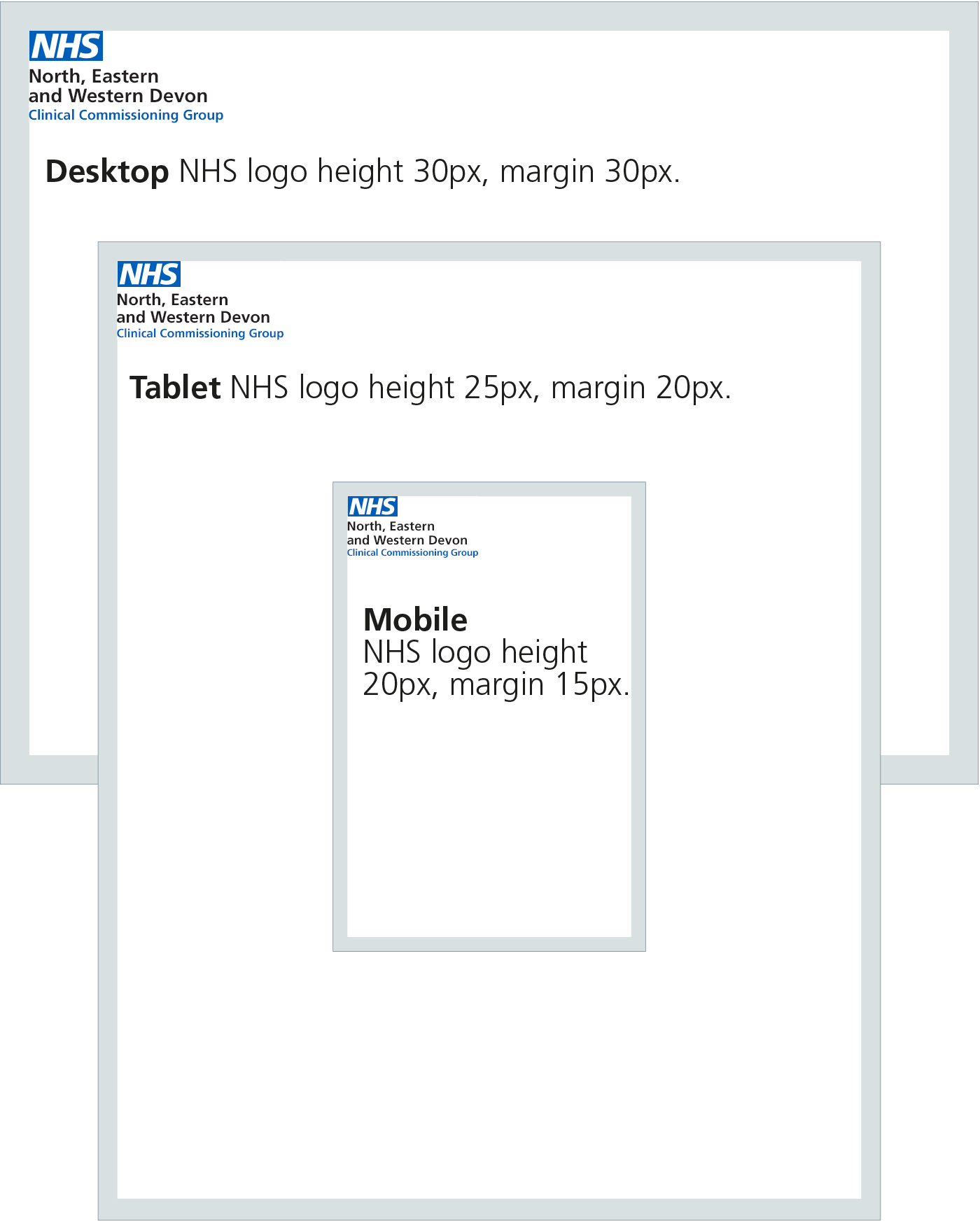
The following shows the NHS logo height and margin sizes for typical desktop and mobile screen sizes.
The minimum size that the NHS logo can appear in digital applications is 20px high. It is important to stress that this is a minimum. The only exception to this is when designing favicons for web browsers, as they can typically be as small as 15px square.
Where recommended margins cannot be achieved, the minimum digital exclusion zone of half the NHS logo height should be observed.
Mobile phone (<600px width) Margin 15px. NHS logo height 20px.
Tablet (>600px and <1000px width) Margin 20px. NHS logo height 25px.
Desktop (>1000px width) Margin 30px. NHS logo height 30px.
6. Ambulance service Crown Badge
Ambulance Trusts/Foundation Trusts can use your Crown Badge alongside your NHS organisational logo.
Your Crown Badge should be sized and positioned as per the examples shown. The Crown should always sit higher than the NHS logo, with the central dip of the Crown aligning with the top of the NHS logo. The bottom of the wreath should align with the base of your NHS organisational logo. This ensures the two logos appear in equal proportion.
If you choose to position your Crown Badge directly next to your NHS organisational logo, then visually and practically, the approach shown below works best. Both logos would appear together, either right aligned for print and offline materials or with the option to left align for digital communications. The space between the two should be the height of the NHS logo. If you choose to separate the two logos, the important principle is to follow the guidelines for positioning of your NHS organisational logo and to maintain the relative size and horizontal alignment of your Crown Badge.
You should not use your Crown Badge on its own without your organisational logo, or adjust the relative position or size of the two elements.
Crown Badge format for right aligned logo
Crown Badge format for left aligned logo
The same sizing guidelines should be observed for your Crown Badge logo as for a standard NHS organisational logo. The same exclusion zones for print and digital also apply to your Crown Badge logo, as shown in the examples below:
Please see examples of applying your NHS organisational logo and your Crown Badge logo to uniforms and vehicles.
Each Ambulance Trust/Foundation Trust has its own unique Crown Badge and its use is restricted to them alone. The design and use of individual Crown Badges is granted and controlled by the King of Arms, under Crown Authority. Third party providers therefore cannot use an ambulance service’s Crown Badge on any communication medium, including on vehicles, print, digital applications or elsewhere.
7. One NHS logo on a page
There should never be more than one NHS logo on a page. Duplicate or multiple NHS logos look untidy and dilute the strength and impact of the NHS Identity.
8. Using the NHS logo within text
The NHS logo must not be embedded in a line of text as a substitute for the letters ‘NHS’.
9. Alternative logos
Our research shows that where NHS organisations are using alternative logos either instead of, or as well as their NHS organisational logo, it creates confusion, mistrust and concern.
Our patients expect a national, unified health service. At all patient touchpoints of that service, they expect to see the NHS logo, and the identity, applied consistently and uniformly. It reassures them that they can rely on the quality of service being provided.
Where people see a second, alternative logo they perceive it is a service provided by the private sector or a service run in partnership with another independent non-NHS organisation. Therefore, alternative logos to your NHS organisational logo are not permitted. This includes alternative logos for buildings, departments, teams, services, programmes and partnerships. However, you can create a distinctive visual style to differentiate your NHS organisation from others.