Applying accreditation marks to communications
Accreditation marks should be positioned in a supporting position, at the bottom of NHS communications (e.g. at the base of letterheads, recruitment advertising, web pages etc.).
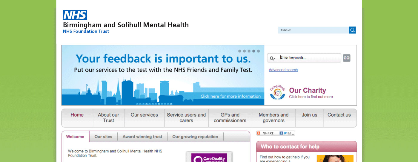
The preferred background colour for NHS communications is white, which enables accreditation marks to be applied in colour.
Accreditation marks should not appear larger than your NHS organisational logo, but be large enough for any text contained within them to be legible. For official trade marks, such as Investors in People, you should follow the guidelines supplied upon your organisation’s accreditation.
Please note as this is a website, there is the option to position the NHS organisational logo top left, as people often expect to see the search facility in the top right area of a website. The NHS logo and type underneath it then needs to be ranged left.