Mixed partnership public health campaign (poster)
Where multiple organisations are working together in an equal partnership to deliver a public health campaign, the partners logos’ should appear in a line, ideally along the top of the page. The NHS logo is used on its own where a number of NHS organisations are involved in the partnership.
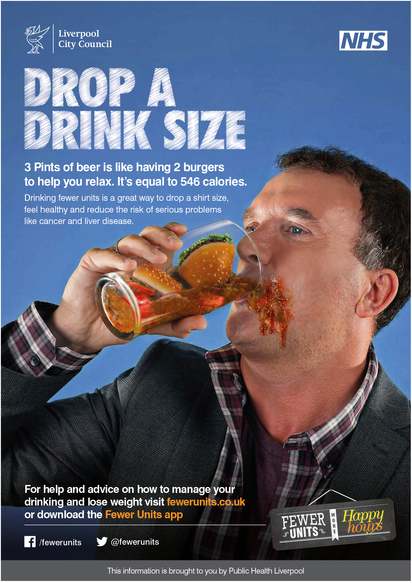
The NHS organisation’s logo or NHS logo would ideally appear top right and graphic devices and straplines positioned away from the logos, as shown here. In this example, the NHS logo has been used as there are a number of NHS organisations involved in the partnership. Normally you would list the names of the NHS organisations involved. However, this may not always be practical on materials such as posters, but you would expect to see them listed on other materials (e.g. leaflets, website).
If multiple organisations are working together in an equal partnership, no individual partner’s visual style should dominate.
In this example, the NHS logo has been reversed out. As this is not an NHS-led campaign the NHS Blue has not been used, but the colour is close enough to be acceptable.