NHS organisation’s app
An NHS organisation’s app icon should include the NHS logo to signify it is an app developed and owned by an NHS organisation.
In this case, national, regional and local NHS organisations should use the national NHS logo on its own because the icon’s small size prohibits them using their organisation’s full logo. However, every effort must be made to distinguish the icon from other NHS organisations through the use of other naming conventions and/or graphic devices.
Where possible and practical, the NHS logo should appear on a white background on the app’s icon and adhere to the minimum size and exclusion space.
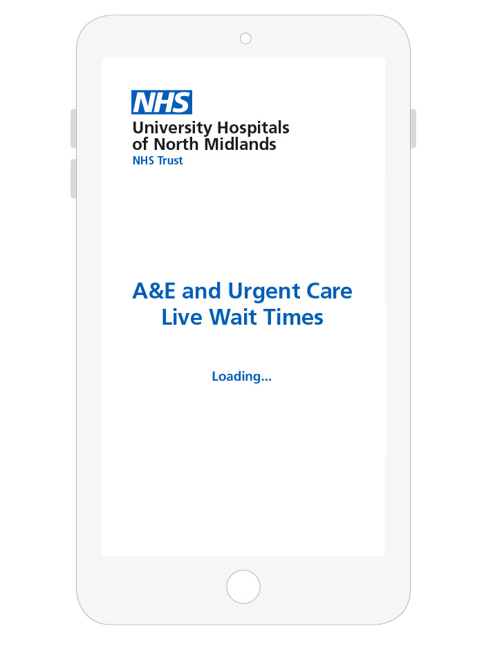
The NHS organisation’s full logo should be applied to the app loading/startup screen, the login screen, or the home screen – or all three. It can be left or right aligned as this is a digital application.
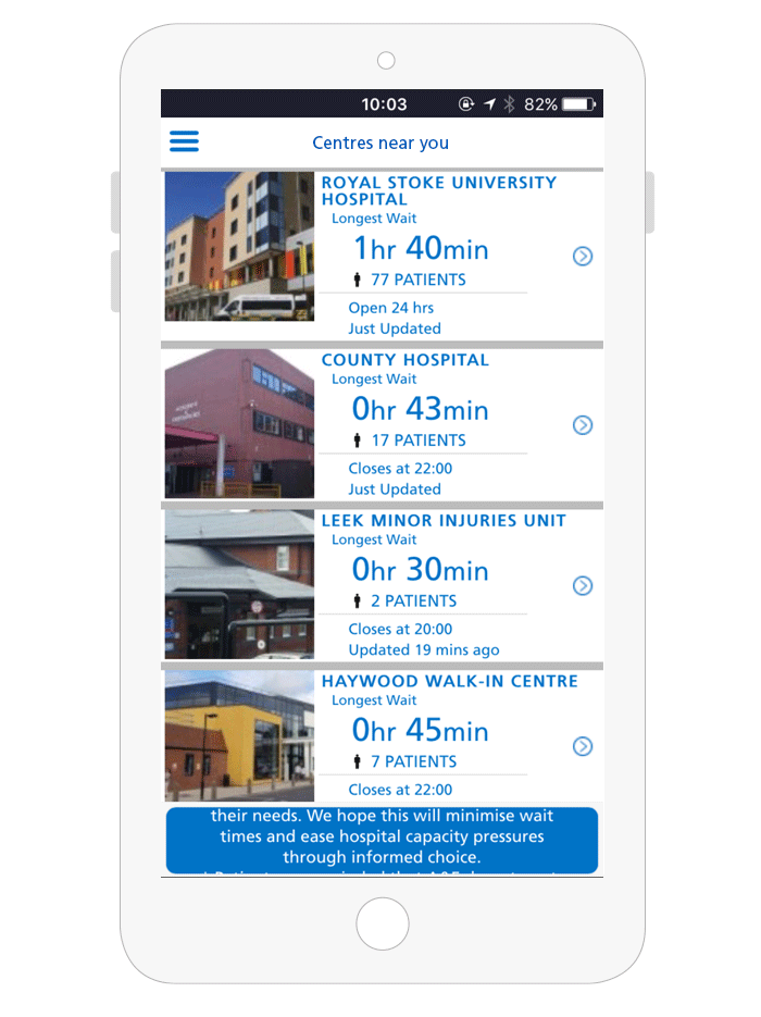
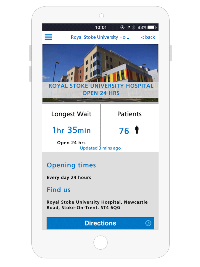
The depth of the top bar on a content page is extremely shallow and unsuitable for including an NHS organisation’s full logo. Therefore, the top bar should be used to show the ‘current page’ title, as this information is more useful to the audience.
If the information that a mobile or native app provides is specific to a particular region or group it is very important to make this clear. The geographic region or a clear and descriptive name for the app needs to appear on the app icon, so that patients understand when an app has been developed for use within a geographical area. This information should also be clear in the app description.